article thumbnail

The new normal of digital experience delivery – lessons learned from monitoring mission-critical websites during COVID-19

Dynatrace

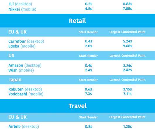
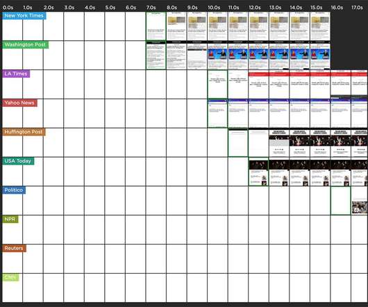
Over the last two month s, w e’ve monito red key sites and applications across industries that have been receiving surges in traffic , including government, health insurance, retail, banking, and media. Media p erformance . Watching media sites including CNN, Fox News, and CNBC has been very interesting.

Website 214
article thumbnail

How digital experience monitoring helps deliver business observability

Dynatrace

Fast, consistent application delivery creates a positive user experience that can ultimately drive customer loyalty and improve business metrics like conversion rate and user retention. Expanding on the traditional observability pillars of metrics, logs, and traces, DEM collects user experience data to complete the end-to-end picture.

Insiders

Sign Up for our Newsletter

This site is protected by reCAPTCHA and the Google Privacy Policy and Terms of Service apply.

Trending Sources

article thumbnail

Industry page speed benchmarks (March 2022)

Speed Curve

Page Speed Benchmarks is an interactive dashboard that lets you explore and compare web performance data for leading websites across several industries – from retail to media – over the past year. Key metrics. These visuals are a great tool for validating the best metrics to focus on for your pages.

article thumbnail

Introducing Page Speed Benchmarks – a new resource for the performance community

Speed Curve

Here are some common questions I’m asked when I talk with people about performance: Which metrics should I care about? Page Speed Benchmarks is an interactive dashboard that lets you explore and compare web performance data for leading websites across several industries – from retail to media. How fast should I be?

article thumbnail

Why you need to know your site's performance poverty line (and how to find it)

Speed Curve

"I made my pages faster, but my business and user engagement metrics didn't change. The performance poverty line is the plateau at which changes to your website’s rendering metrics (such as Start Render and Largest Contentful Paint) cease to matter because you’ve bottomed out in terms of business and user engagement metrics.

article thumbnail

A Complete Guide to Performance Budgets

Speed Curve

A performance budget is a threshold that you apply to the metrics you care about the most. A good performance budget chart, such as the one above, should show you: The metric you're tracking The threshold you've created for that metric When you exceed that threshold How long you stayed out of bounds When you returned to below the threshold 3.

article thumbnail

Hero Rendering Times: New metrics for measuring UX

Speed Curve

That's why we're very excited to introduce Hero Rendering Times, a set of new metrics for measuring the user experience. These metrics are available right now to SpeedCurve users. A brief history of UX metrics. This metric, which is measured in WebPageTest , identifies when the visible parts of a page are displayed.

Metrics 49