


Planning for Responsive Images
CSS - Tricks
MARCH 13, 2019
The first time I made an image responsive, it was as simple as coding these four lines: img { max-width: 100%; height auto; /* default */ }. What happens if the the image in the src attribute is heavy? That’s all the business analysis you need to understand that CSS width doesn’t cut it for responsive images.
 72
72 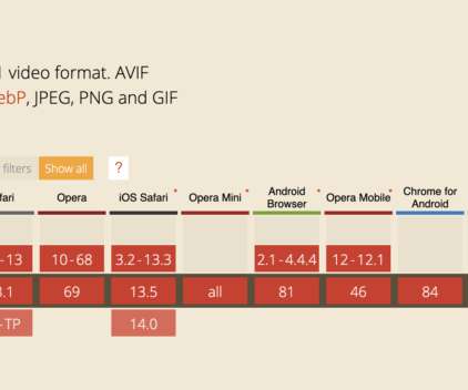


Let's personalize your content