Why you need to know your site's performance plateau (and how to find it)

"I made my pages faster, but my business and user engagement metrics didn't change. WHY???"
"How do I know how fast my pages should be?"
"How can I demonstrate the business value of performance to people in my organization?"
If you've ever asked yourself any of these questions, then you could find the answers in identifying and understanding the performance plateau for your site.
What is the "performance plateau"?
The performance plateau is the point at which changes to your website’s rendering metrics (such as Start Render and Largest Contentful Paint) cease to matter because you’ve bottomed out in terms of business and user engagement metrics.
In other words, if your performance metrics are on the performance plateau, making them a couple of seconds faster probably won't help your business.
The concept of the performance plateau isn't new. I first encountered it more than ten years ago, when I was looking at data for a number of sites and noticed that – not only was there a correlation between performance metrics and business/engagement metrics – there was also a noticeable plateau in almost every correlation chart I looked at.
A few months ago someone asked me if I've done any recent investigation into the performance plateau, to see if the concept still holds true. When I realized how much time has passed since my initial research, I thought it would be fun to take a fresh look.
In this post, I'll show how to use your own data to find the plateau for your site, and then what to do with your new insights.
Background
For this new investigation, I selected four sites that experience a significant amount of user traffic. For each site, I used a month's worth of RUM (real user monitoring) data to generate correlation charts.
Correlation charts show the relationship between performance metrics – in these instances, Start Render and Largest Contentful Paint (LCP) – and user engagement (measured as bounce rate). They're a great tool for showing non-technical folks how performance affects the business. (You can also create correlation charts that show the relationship between performance metrics and business metrics, such as conversion rate and cart size, but bounce rate is easier to measure right out of the box with most RUM tools.)
Results
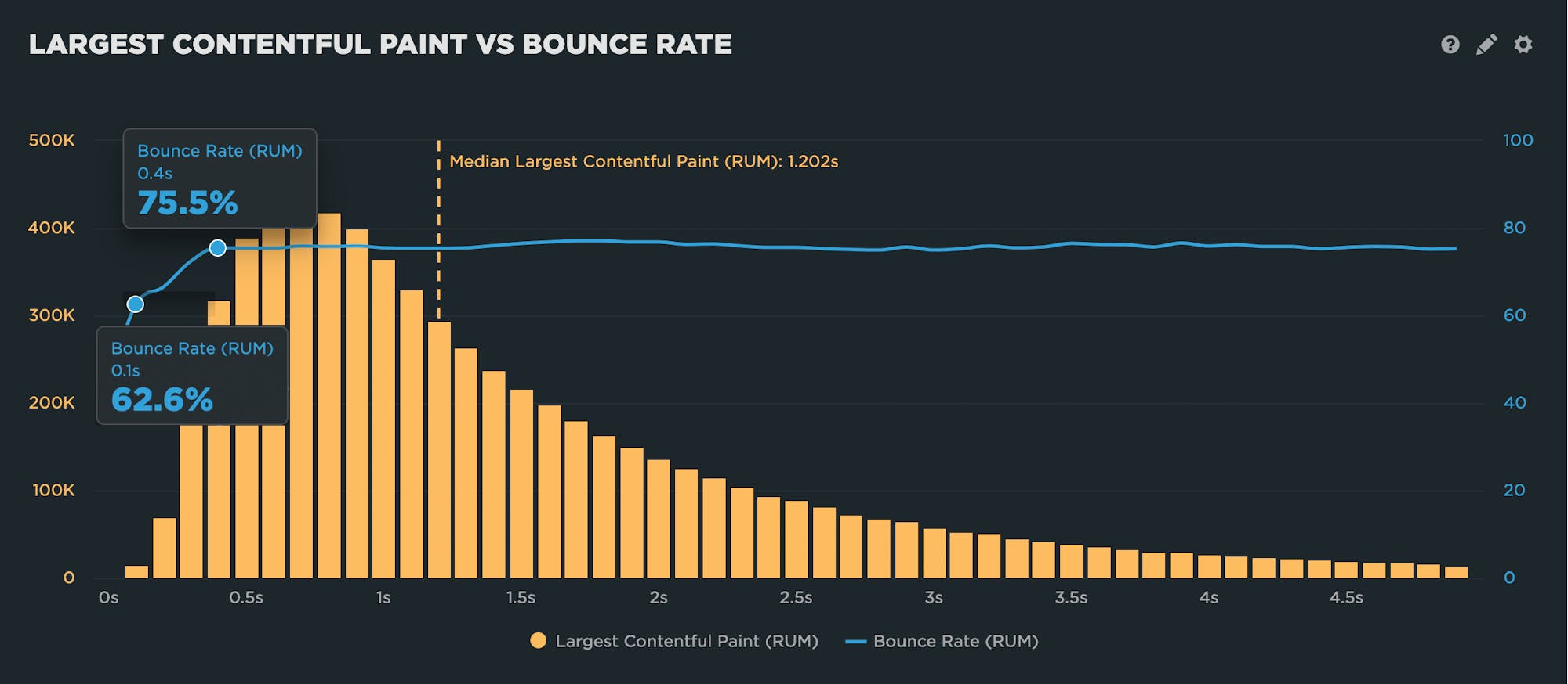
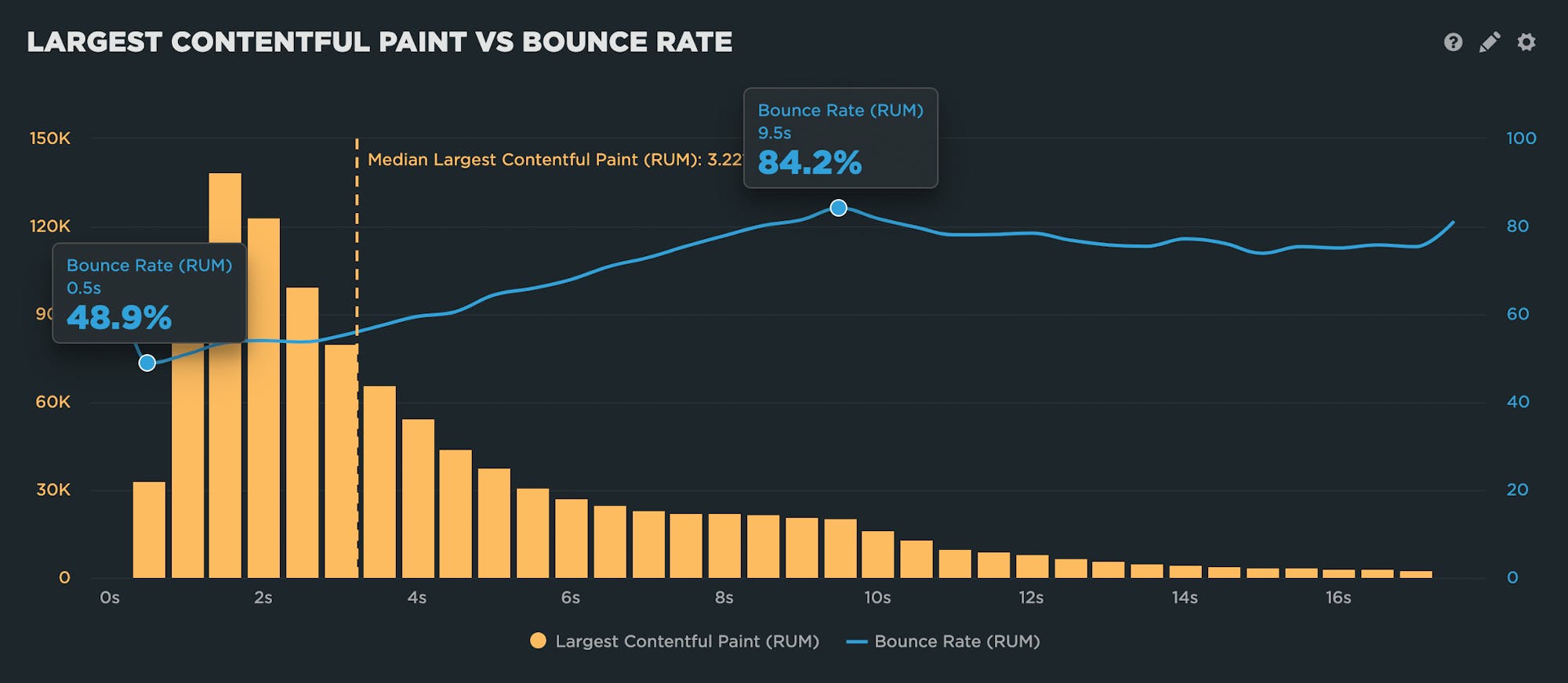
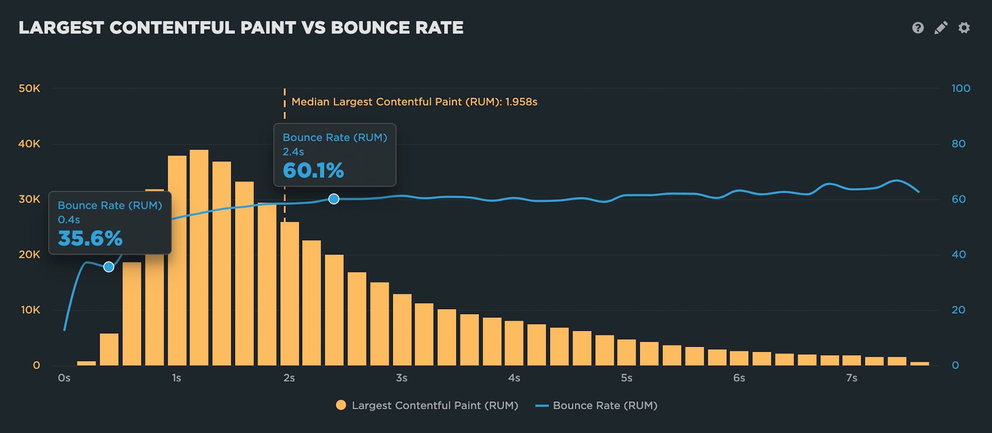
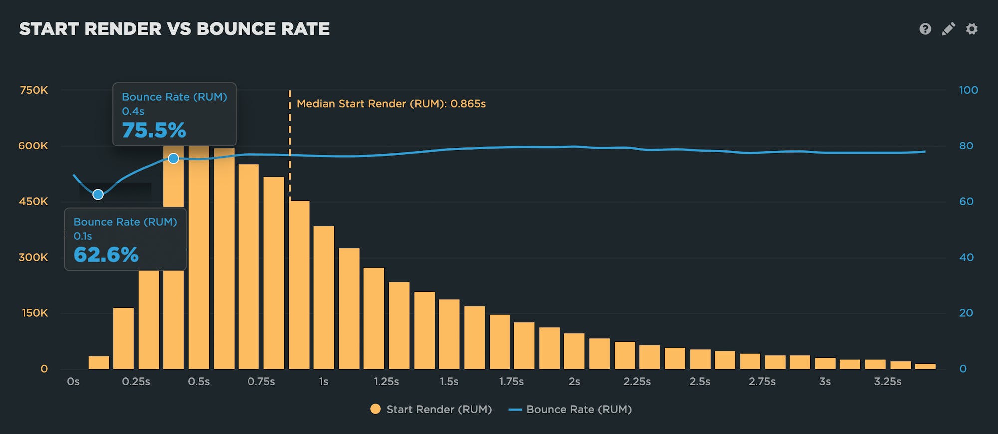
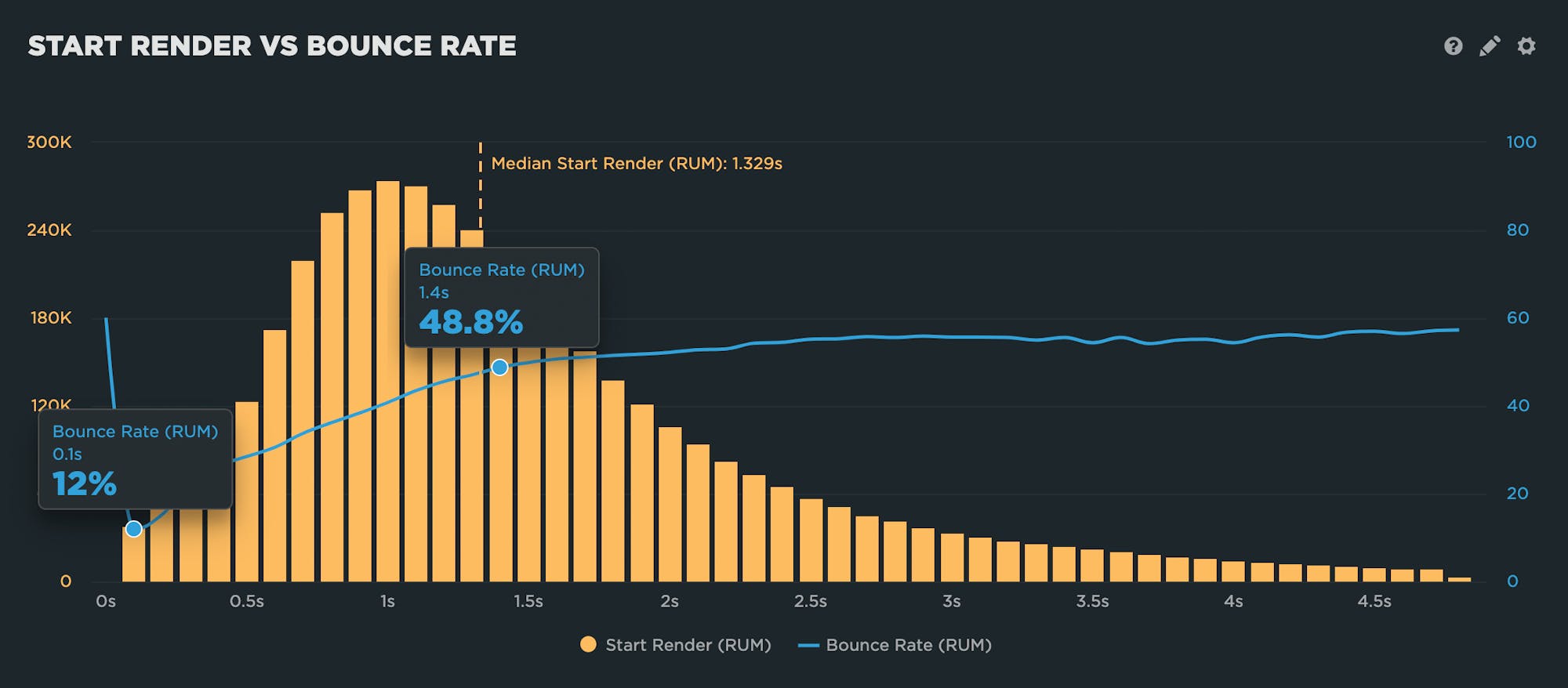
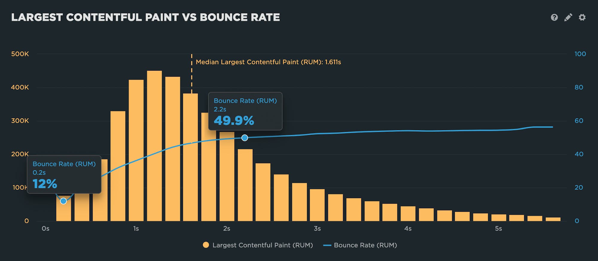
The correlation charts below show the distribution of all visits, with each yellow bar representing a cohort of visits that experienced a given Start Render or LCP time. The blue bar represents the change in bounce rate across all cohorts.
In each of the correlation charts below, I've highlighted:
- Optimal speed – The cohort of sessions that correlated with the lowest (aka best) bounce rate for that site
- Beginning of the performance plateau – The cohort of sessions where the bounce rate begins to plateau
- Median measurement for all visits represented in the chart
Keep reading for observations and takeaways.
Site A
Site B
Site C
Site D
Observations
1. A clear performance plateau emerged for each site
Each site experienced a plateau at which business metrics remained more or less the same as performance continued to degrade.
2. Plateaus emerged for both Start Render and Largest Contentful Paint
I expected the results for Start Render, as it's been around as a page speed metric for many years, and has been proven to correlate to business metrics. LCP is relatively new, and has received a great deal of attention since it was introduced a couple of years ago as part of Google's Core Web Vitals. It's good to see evidence that it's a meaningful metric to track in terms of business goals.
3. The plateau emerges surprisingly quickly in some cases
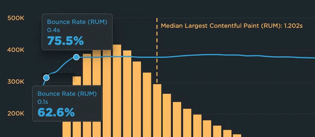
For example, Site C's performance plateau starts at 400 milliseconds. That's early!
4. There's a lot of variability in the distance between the optimal bounce rate and the plateau
For some sites, you can see a much steeper incline in the curve from optimal to plateau. For some sites (such as Site C), the difference was as little as 300 milliseconds. For others (such as Site A), the gap was as long as 9 seconds.
5. The plateau sometimes started later when looking at LCP
Creating correlation charts in both Start Render and LCP generated interesting results. In two of the four sites I looked at, the charts were roughly comparable. For the other two sites, the plateau started later for LCP than it did for Start Render. This could be attributed to the fact that LCP measures when the largest visual element has completely finished rendering, so it can occur much later than Start Render.
6. For some sites the performance plateau starts well before the median
Predictably, the optimal bounce rate generally correlated to the cohort of sessions that is much faster than the median. A bit more surprisingly, for some sites the performance plateau started well before the median. This could come as a scary revelation for some site owners, because it means that the bulk of your user sessions are occurring on the plateau.
How to measure the performance plateau for your own site
I can't emphasize enough that the examples I've shared are illustrative, not prescriptive. The performance plateau for your site will be different from the plateau for another site. You need to look at your own real user data. (If you're new to performance, you might be interested in this synthetic and real user monitoring explainer.)
Fortunately, the process for identifying the low end of your site’s performance threshold is fairly straightforward. All you need is access to a statistically significant amount of your RUM data, plus whatever analytics tool you use for tracking business or user engagement metrics.
Step 1: Identify the metrics you want to measure
As mentioned above, bounce rate is a good metric to start with, because it's already gathered automatically by most real user monitoring tools.
If you have access to other data sources, then you can create a variety of correlation charts, If run an ecommerce site, then you can measure revenue, cart size, and conversion rate. If you work on a media site, then page views and bounce rate matter.
Step 2: Gather lots of real user data
To ensure that you get statistically relevant results, the more data you can gather, the better. If your dataset is too small, you could get wonky results. When I conducted my investigation, I aggregated millions of transactions that took place over a single month. (If you're interested in trying real user monitoring, you can start a free RUM trial in speedCurve.))
Step 3: Create correlation charts
I've demonstrated how I like to show bounce rate (or whatever business/engagement metric you're plotting) across the distribution of sessions. (If you're a SpeedCurve user, here's how to create correlation charts.)
What to do with your findings
After you've finished your own investigation, you can do a few things with the results:
1. Share your findings within your organization
Correlation charts are a powerful tool for showing stakeholders the impact that site speed has on the business. Even if your results aren't what you hoped they would be, you can use this data to prove the value of continuing to invest in performance.
2. Understand why your business metrics are not improving despite your efforts
This might seem a bit demoralizing, but when you think about it, it's actually helpful to know. When you know where your performance pleateau begins, you can answer the question "Why don't my business or user engagement metrics improve when I make my site faster?" If you improve Start Render from 5 seconds to 3 seconds, but the performance plateau for your site starts at 2 seconds, you haven't yet made Start Render fast enough.
3. Change your performance targets
Set targets for moving more of your users into the cohorts that experience faster Start Render or LCP times. Ideally, improving key site speed metrics for more of your users should improve bounce rate (or whatever user engagement or business metric you're tracking) for more of your users. Ultimately, this is good for your business.
You can use your performance plateau to set goals. Continuing with the example in point 1, above, if you know that the plateau starts at 2 seconds, you can create a Start Render target of 1.5 seconds to work toward.
4. Or don't change your performance targets
In the Site C example, the optimal bounce rate occurs for the 100-millisecond LCP cohort, and the plateau starts just 300 milliseconds later. With a huge amount of work, you might succeed in delivering faster LCP times to more sessions, but would the effort be worth it?
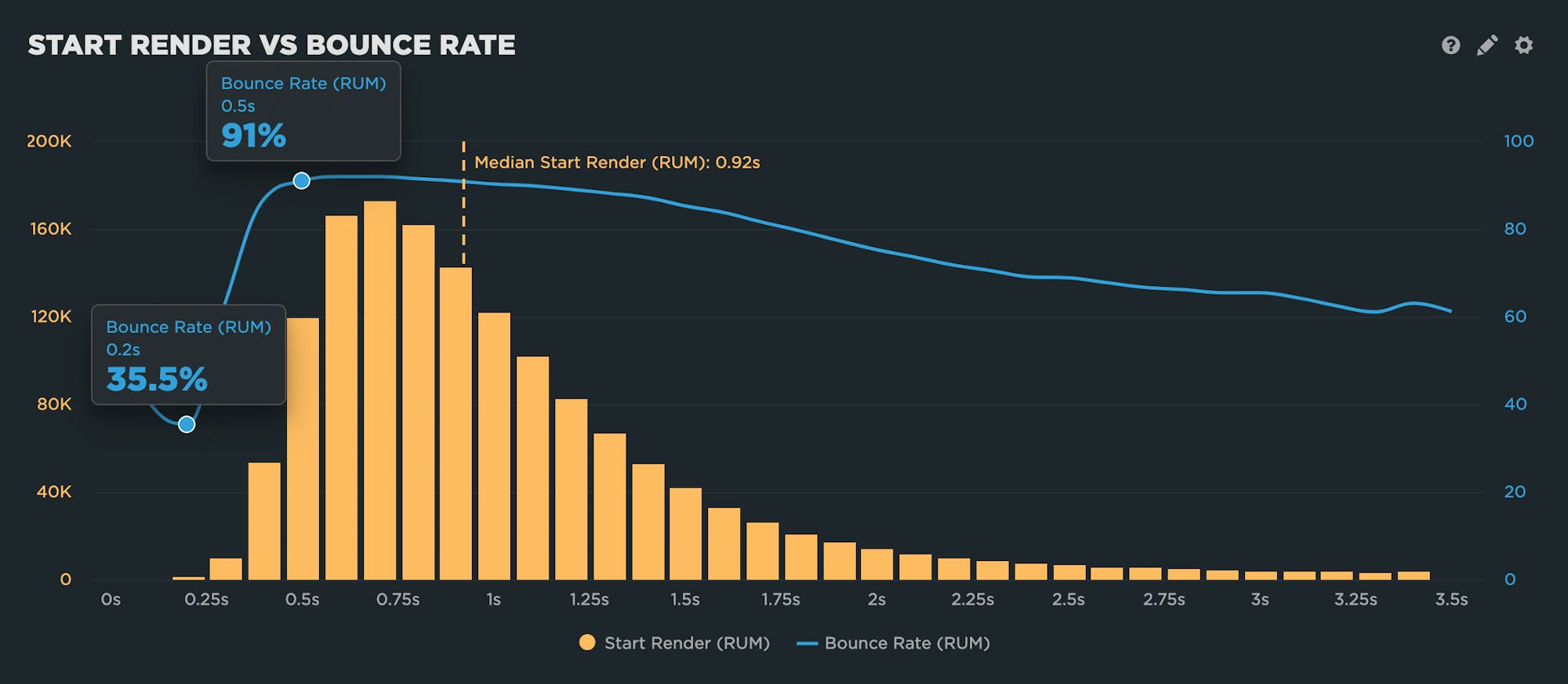
As the close-up view of the chart below shows, the bulk of sessions have speedy LCP times that are at the beginning of the performance plateau. In this case, the chart shows that perhaps you can be satisfied with your efforts, and your focus should be on fighting regressions and staying fast.
5. Create a baseline to measure against
Repeat this exercise periodically – perhaps monthly, or semi-annually, or after a deploy where you've made a number of performance improvements – and compare the correlation charts over time. Ideally, you'll see more of your sessions fall into the faster section of the distribution, before the performance plateau.
Questions? Feedback?
If you experiment with creating correlation charts and plotting the performance plateau for your site, I'd love to hear about your results!
Related:
- Web performance for retailers
- How to create correlation charts
- How to benchmark your site against your competitors
- How to set up real user monitoring (RUM)

Read Next
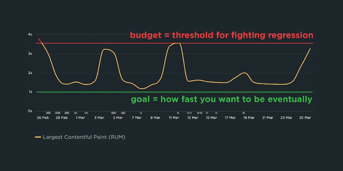
If you're not already using performance budgets to prevent regressions, you should be! Here's how to get started.

See how customers are using SpeedCurve to make their sites faster.