Exploring performance and conversion rates just got easier

Demonstrating the impact of performance on your users – and on your business – is one of the best ways to get your company to care about the speed of your site.
Tracking goal-based metrics like conversion rate alongside performance data can give you richer and more compelling insights into how the performance of your site affects your users. This concept is not new by any means. In 2010, the Performance and Reliability team I was fortunate enough to lead at Walmartlabs shared our findings around the impact of front-end times on conversion rates. (This study and a number of other case studies tracked over the years can be found at WPOstats.)
Setting up conversion tracking in SpeedCurve RUM is fairly simple and definitely worthwhile. This post covers:
- What is a conversion?
- How to track conversions in SpeedCurve
- Using conversion data with performance data for maximum benefit
- Conversion tracking and user privacy
What is a conversion?
The performance of your website can make or break engagement with your users. Lighthouse scores and audits and Core Web Vitals thresholds (which are both available in SpeedCurve) offer guidance on thresholds and optimizations, but they can't show you how performance affects user behavior and outcomes.
It's not enough to improve your Lighthouse score or Core Web Vitals results. You need to validate that improving your performance metrics actually helps improve user experience, and ultimately your business metrics. This is where conversion tracking comes in.
Simply put, a conversion is a measurable outcome for a user session. Those outcomes can take many forms, such as:
- Checkout events, such as adding an item to a shopping cart or paying for an order
- Signing up for a newsletter
- Downloading an ebook
- Requesting a quote for a service
- Booking a hotel reservation
Those are all examples of conversions.
How do you track conversions in SpeedCurve?
One of the biggest factors I've seen that keeps people from tracking conversions alongside performance data is the assumption that it's difficult to configure and requires code modifications. This is no longer the case!
Conversions are one example of custom data you can collect in SpeedCurve. There are two supported methods for tracking a conversion in SpeedCurve:
- Using the JavaScript API, you can instrument your code to include:
LUX.addData('order_confirmed', 1) - Or you can elect to flag conversions based on the traffic to a known URL pattern
domain.com/checkout/orderconfirmation*
This second option has become the preferred method for users due to the frictionless 'no code' approach.
Learn more: Setting up conversion tracking in SpeedCurve
Methods and use cases for using conversion data
After you've added conversion data to SpeedCurve, there are a few different ways you can use it.
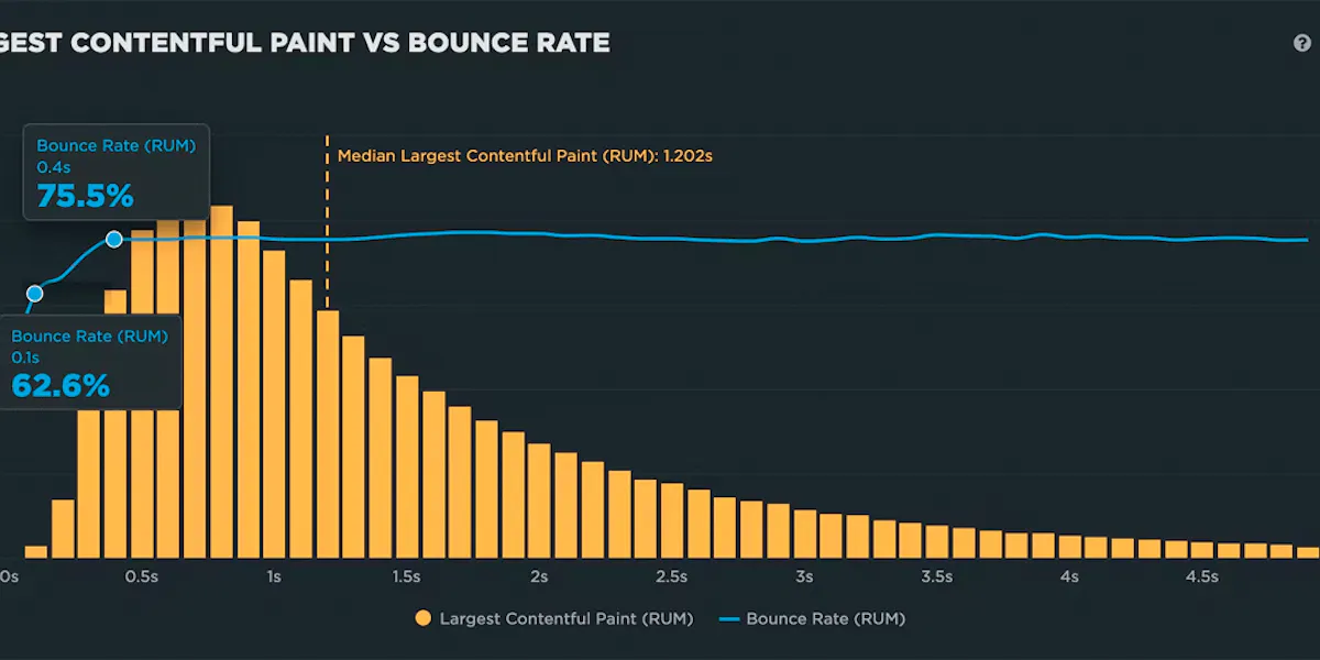
Correlation charts
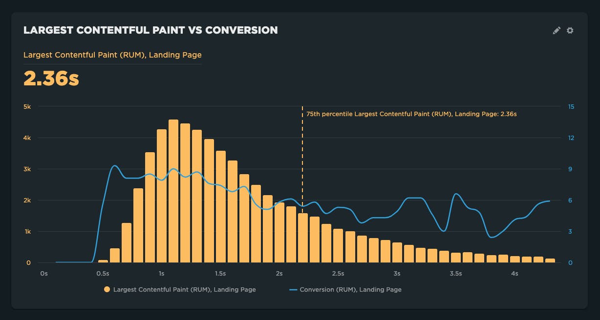
Correlation charts demonstrate how sensitive users are to different metrics. Correlation charts give you a histogram view of all your user traffic, broken out into cohorts based on performance metrics such as Start Render and Largest Contentful Paint. The chart also includes an overlay that shows you a user engagement metric or business metric – such the bounce rate or conversion rate – that correlates to each of these cohorts. This lets you see at a glance the relationship between performance, user engagement, and your business.
In the example below, Largest Contentful Paint has a demonstrated negative correlation with the conversion rate. In other words, as sessions get slower, the conversion rate gets worse.
Some metrics <cough, First Input Delay, cough, cough> end up having little to no correlation with goal-based metrics like conversion.
Sometimes results vary by site. For example, conversion rates for luxury goods tend to be much lower than for commodity goods. So for some brands, not only are conversions low, but users seem to have much more tolerance due to higher switching costs. This is why it's so important to look at your own data when understanding which metrics matter for your site.
Whether you attempt to shoot holes in it or not, it's pretty easy to get behind the idea that the data in correlation charts is at least directionally accurate.
Illustrating this relationship can help justify resourcing for page speed and improving the user experience. Stakeholders who aren't in the weeds on performance can at least understand the potential impact on revenue.
On the other hand, this chart is not super helpful as an operational tool on a daily basis. Typically it is used to prove a point to stakeholders, or validate which metrics you should be focused on. It's not something you really need in your daily performance toolbox.
Learn more: Creating correlation charts
Time series charts and trend analysis
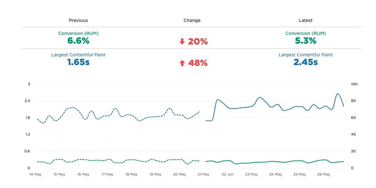
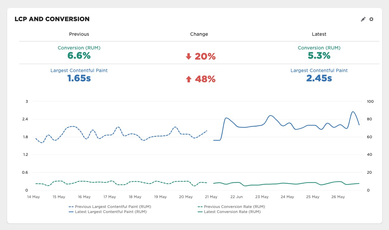
Trending metrics over time is nothing new and pretty commonplace for any metrics you collect consistently. Conversion is no different. It's important to see how user behavior changes during time of day, time of week, during a major campaign, etc.
It's also helpful to see if performance is having a sustained direct impact. In this example, there was a regression in LCP, which appears to have had a sustained impact on conversion rate.
Learn more: Trend metrics & compare time periods
A/B testing and cohort analysis
Segmenting user sessions gives you the ability to compare cohorts to each other and see how each group trends over time.
In the example below, segmentation is done using custom dimensions to compare an A/B test where front-end optimizations were made in the variant. This allows you to see if improvements to conversion are consistent or more variable and not as definitive.
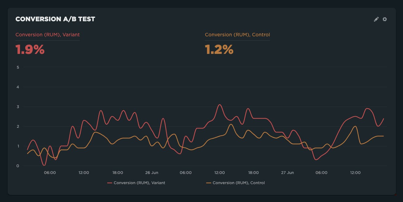
After looking at this data, there was much more confidence in the positive impact the changes had on conversion rates.
Learn more: A/B testing in RUM
Comparing converted sessions and pages
Once you've started tracking conversions, you can really open up the possibilities in some of our default dashboards.
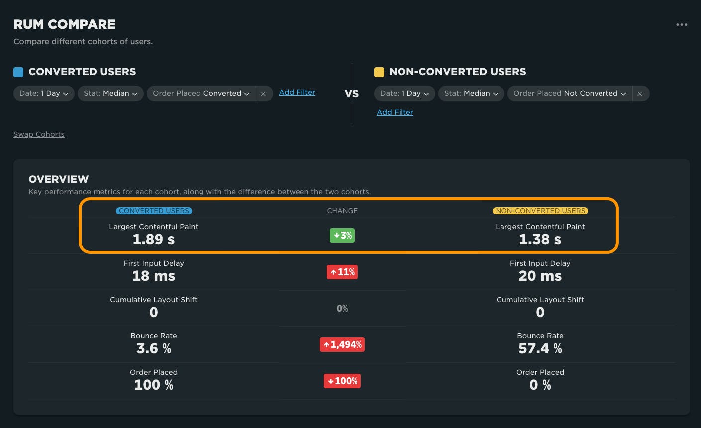
We recently released the RUM Compare dashboard. This unique view allows you to compare different cohorts to each other and understand the differences in metrics, often driven by demographics or particular clusters of users exhibiting a distinct behavior. Sometimes this is a time-based cohort, while other times it's an A/B test. However, one of the more interesting questions this can help to answer is "What is different between converted sessions and non-converted sessions?"
For example:
On the surface, in the chart below things look to be in conflict with the principle that faster pages = $$. As you can see, the converted sessions have a much slower LCP overall than non-converted sessions. Say it isn't so!
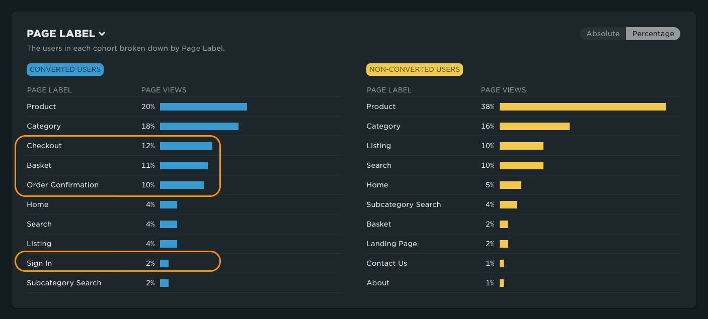
However, after more inspection you see that the makeup of page views for converted sessions contains a lot more checkout pages, which in this case have more backend time, driving up all the front-end focused metrics, such as LCP, for the overall session numbers.
If you break this down further to look at individual page performance where there were common pages, such as product pages, now you can see a different story. Illustrated here, the pages for converted sessions appear have a much faster LCP:
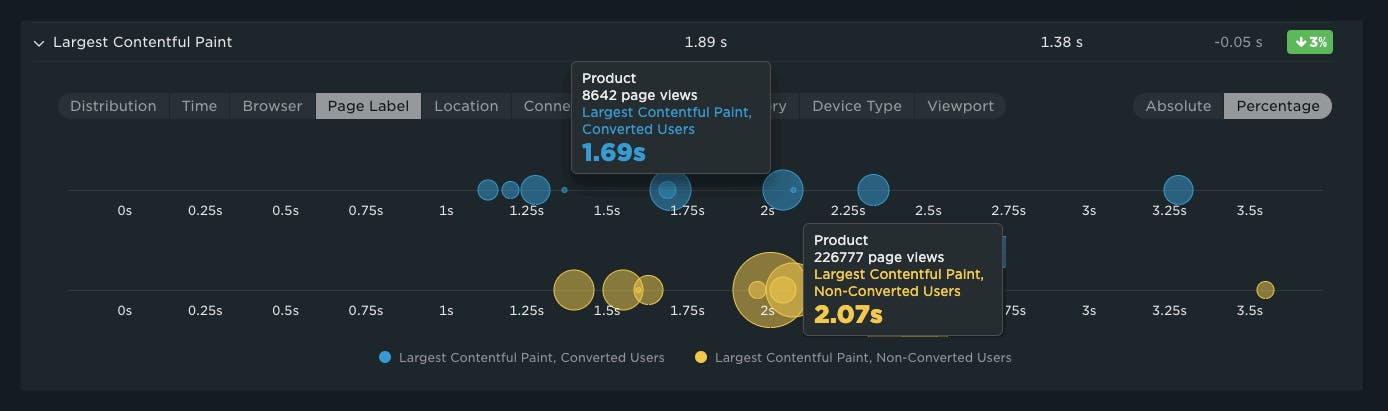
In this case, there is a strong argument for making the product pages faster, even though LCP scores may have been flagged as 'passing' the Core Web Vitals threshold. This is just one example of how the RUM Compare dashboard can be used to explore your converted user base.
User privacy
Data privacy is serious business and always has been at SpeedCurve. We sometimes get customers who are concerned about tracking conversion, fearing that the information collected from end users contains PII (personally identifiable information).
SpeedCurve RUM does not gather any personally identifiable information such as IP addresses, localStorage, and cookies. By tracking conversion, you are simply providing another segment to look at your data. No additional user information is collected. (Click here to learn more about SpeedCurve and data privacy.)
Summary
As a SpeedCurve RUM customer, it's easier than ever to start tracking conversion alongside your performance metrics. Doing so may open up a lot of opportunity to make business-driven decisions about performance.

Read Next
Easily generate side-by-side comparisons for any two cohorts of real user data. This helps you track and improve Core Web Vitals, triage regressions, analyze A/B tests, and more!
Have you ever wondered why your site got faster, but your business and user engagement metrics didn't change? Here's why.