10 things I love about SpeedCurve (that I think you'll love, too)


This month, SpeedCurve enters double digits with our tenth birthday. We're officially in our tweens! (Cue the mood swings?)
I joined the team in early 2017, and I'm blown away at how quickly the years have flown by. Every day, I marvel at my great luck in getting to work alongside an amazing team to build amazing tools to help amazing people like you!
In the spirit of celebration, I thought it would be fun to round up my ten favourite things to do in SpeedCurve (that I think you'll like, too). Keep scrolling to learn how to:
- Fight regressions and stay fast
- See the impact of performance on your business
- Benchmark your site against your competitors
- Track third parties to make sure they're not quietly hurting performance
- Make sure you're tracking the best metrics for your pages
- Get a prioritized list of performance recommendations
- Bookmark and compare synthetic tests and RUM sessions so you can quickly find and fix performance issues
- Run A/B tests so you see how code changes affect your performance and user engagement metrics
- Get customized weekly reports
- Motivate your team with a wall-mounted monitor showing your favourite charts
1. Fight regressions and stay fast
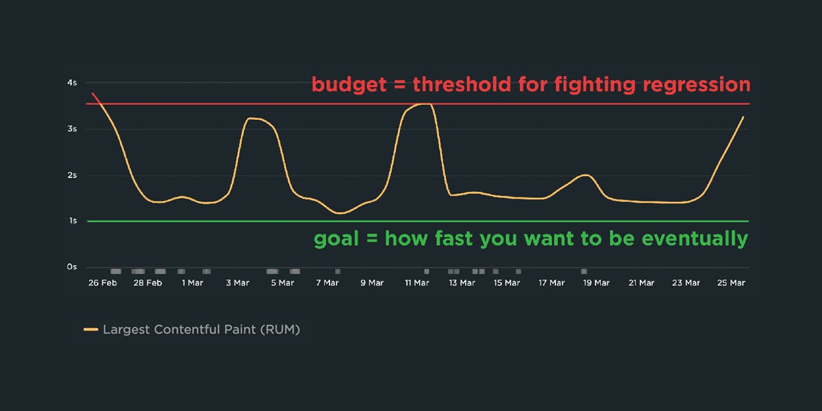
It's easier to make a fast website than it is to keep a website fast. Fighting regressions should be the top priority of anyone who cares about the speed of their site.
The best way to fight regressions is to create performance budgets on key metrics, and get alerted when they go out of bounds. You can even go one step further and integrate your performance budgets with your CI/CD process, so that you not only get alerts but even break the build if a new deploy would violate any of your budgets.
Think of it this way. Imagine that your website is a vault containing billions of dollars in jewels. Your performance budgets are like motion-sensing security cameras that let you know the minute something fishy is up. Integrating your budgets with your CI process is like having your security cameras trigger your guards to rush in and stop the bad guys.
READ: A Complete Guide to Performance Budgets
–––––
2. See the impact of performance on your business
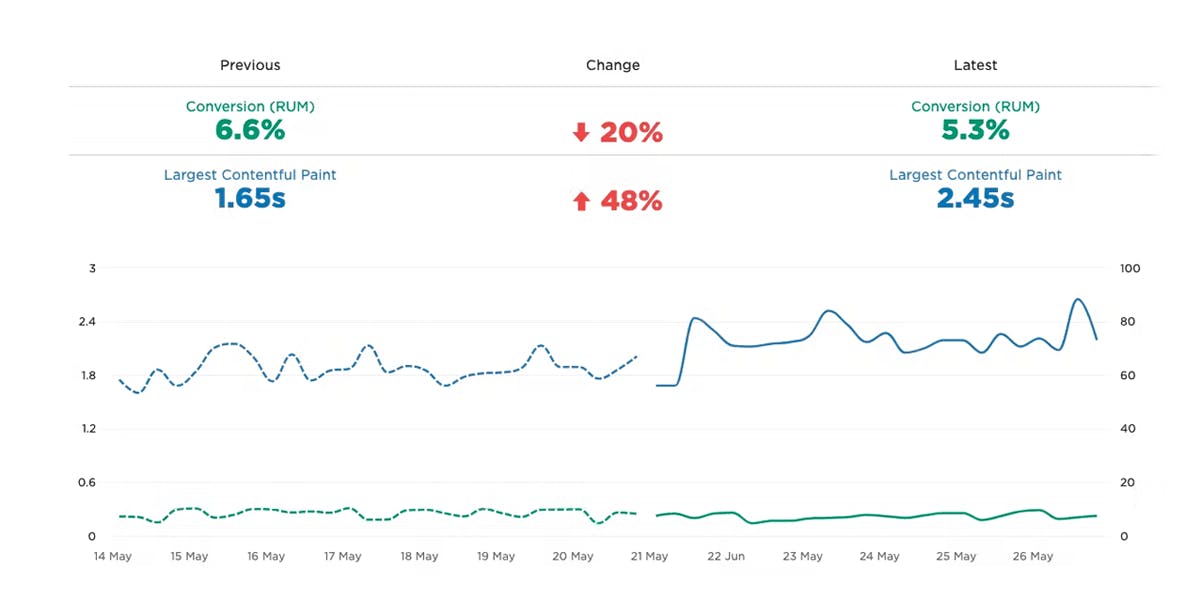
Correlation charts are a great way to communicate the business value of performance to everyone in your business – using your own data. These charts let even the most non-technical stakeholder easily see the correlation between performance and user engagement and business metrics, such as bounce rate and conversion rate.
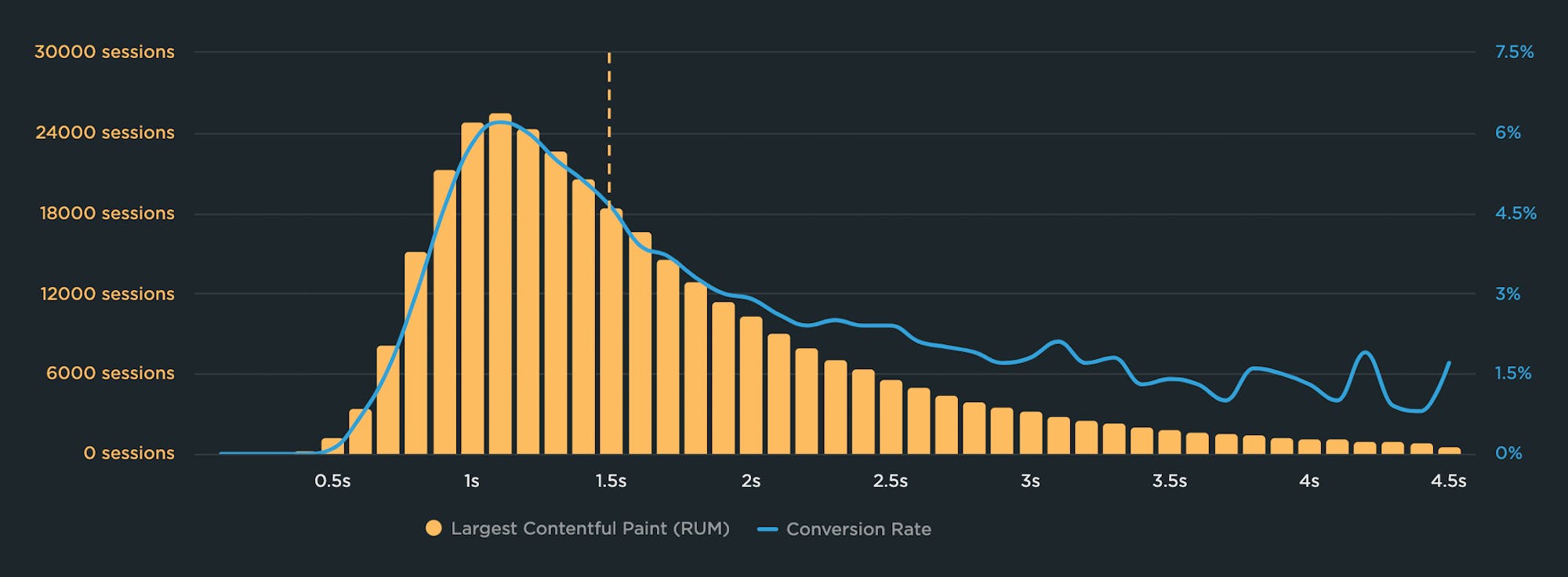
In this correlation chart, you can see that conversion rate peaks at just over 6% for sessions with Largest Contentful Paint (LCP) times of 1.1 second. As LCP gets slower, conversion rate declines quickly and dips below 3% at the 2-second mark. The takeaway here is that improving LCP time for more of this site's visitors could lead to a higher number of conversions overall, and more revenue.
With SpeedCurve RUM, you can create correlation charts that show you the relationship between performance metrics – from start render and LCP to page metrics like image and JavaScript size. You can also add you own data, such as conversion rate and cart size, so you can create custom chart types.
READ: How to create correlation charts
–––––
3. Benchmark your site against your competitors
Our public-facing Industry Benchmarks dashboard gets a lot of visits, but did you know you can create your own custom competitive benchmarking dashboard in SpeedCurve? This is an extremely effective tool for getting your company to care about performance.
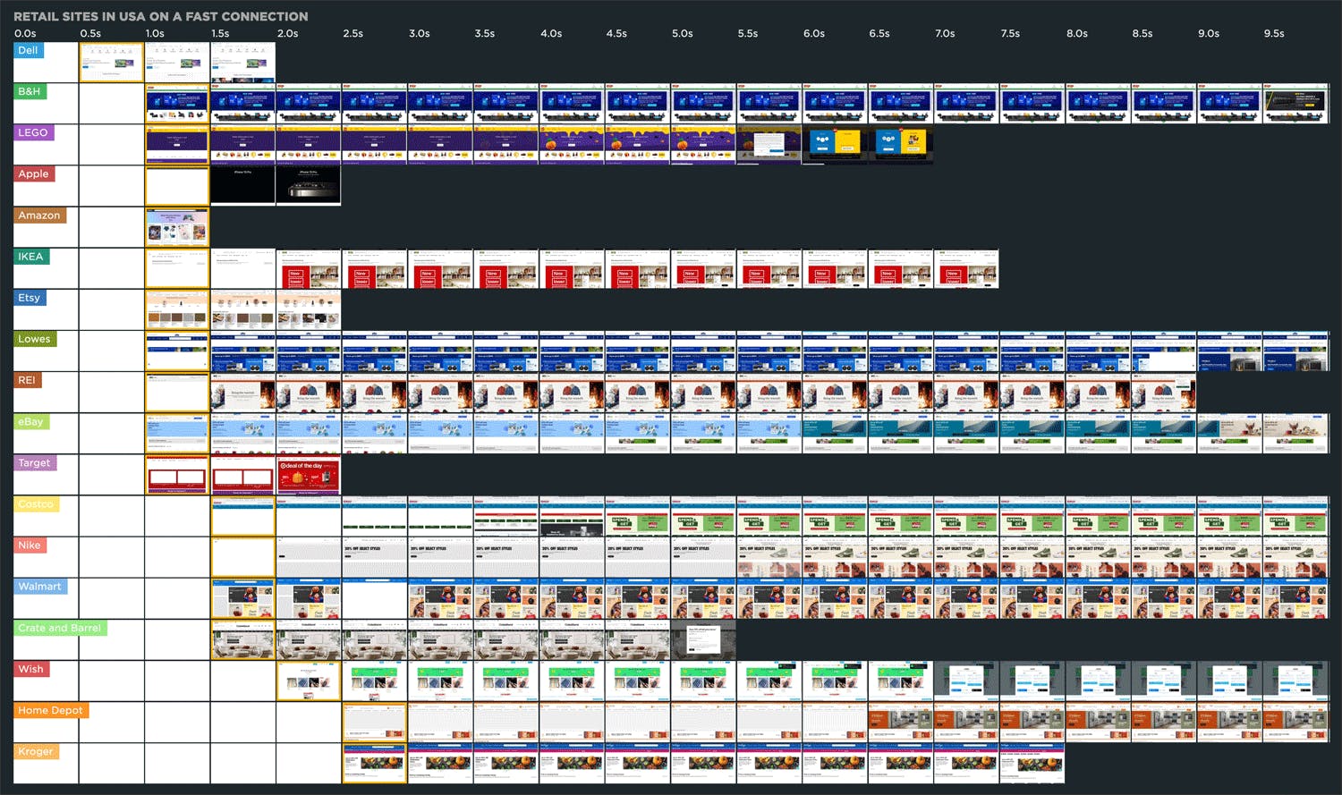
With SpeedCurve Synthetic, you can monitor any other website in the same way that you can monitor your own website. That means you get all that same rich data, screenshots, and filmstrips that you can compare.
You can also drill down and focus on things like construction. That website that's rendering twice as quickly as yours... what are they doing differently? Have they got more JavaScript? Have they got less? Are you making 400 requests and they're only making 80? This is the place to find that out.
And when you've mastered the competition and taken top spot on your leaderboard, it feels pretty darned sweet.
READ: How to create a competitive benchmark dashboard
–––––
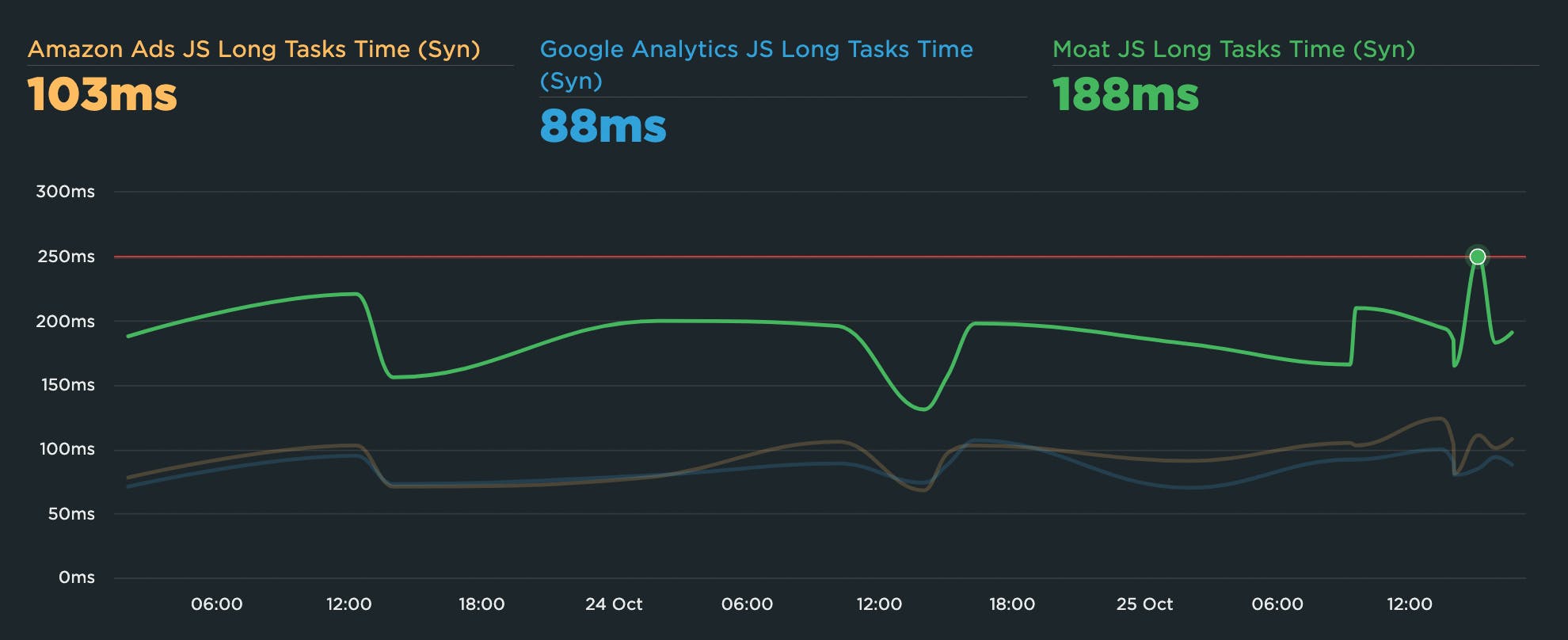
4. Track third parties
These days it's common to see pages with dozens of third-party scripts. Third parties add tons of value by increasing conversions (via targeting beacons) and helping you understand your users in unprecedented ways (via analytics tags). But they can significantly affect how – or even if! – your page renders.
You can't fix what you don't measure. Your SpeedCurve Synthetic third-party dashboard lets you see at a glance how all your third parties are performing. Among (many) other things, you can see which of your scripts have excessive Long Task times (more than 50ms), which could be hurting the interactivity of your pages.
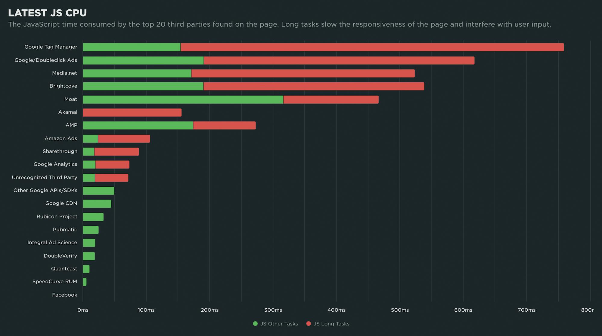
You can also turn on tracking for specific third-party vendors, and then create performance budgets for them so you find out right away if they're suddenly slowing down your pages. If you have a performance SLA with your vendors, you can use your budgets to keep them accountable.
WATCH: How to diagnose a third-party regression
–––––
5. Make sure you're tracking the right metrics
There are a lot of performance metrics out there! You need to make sure you're tracking the right metrics for your pages. Many metrics are great in theory but not in practice, depending on how your pages are built. That's why it's crucial to visually validate your metrics. We've built visual validation into SpeedCurve in many helpful ways.
Core Web Vitals have gotten a lot of attention over the past few years. I love the effort to simplify metrics to a smaller handful that most people can wrap their head around. But Vitals have some limitations, such as:
- They're only available in Chromium-based browsers.
- They don't always correlate to what users see. For example, depending on how you've built your page, Largest Contentful Paint can measure elements like the cookie consent banner, not your main image. (Learn more about LCP caveats.)
It's important to visually validate your metrics to make sure that improving that metric actually helps your users have a faster experience! There are several ways to do this in SpeedCurve, such as...
Drill down into test details
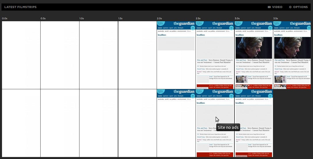
From any synthetic time series chart, you can click on any data point and click 'View Test'. Your test details page includes a lot of helpful information, including an interactive waterfall chart. Hovering over any of the key metrics in this chart will show you how that metric lines up with the filmstrip view of the page.
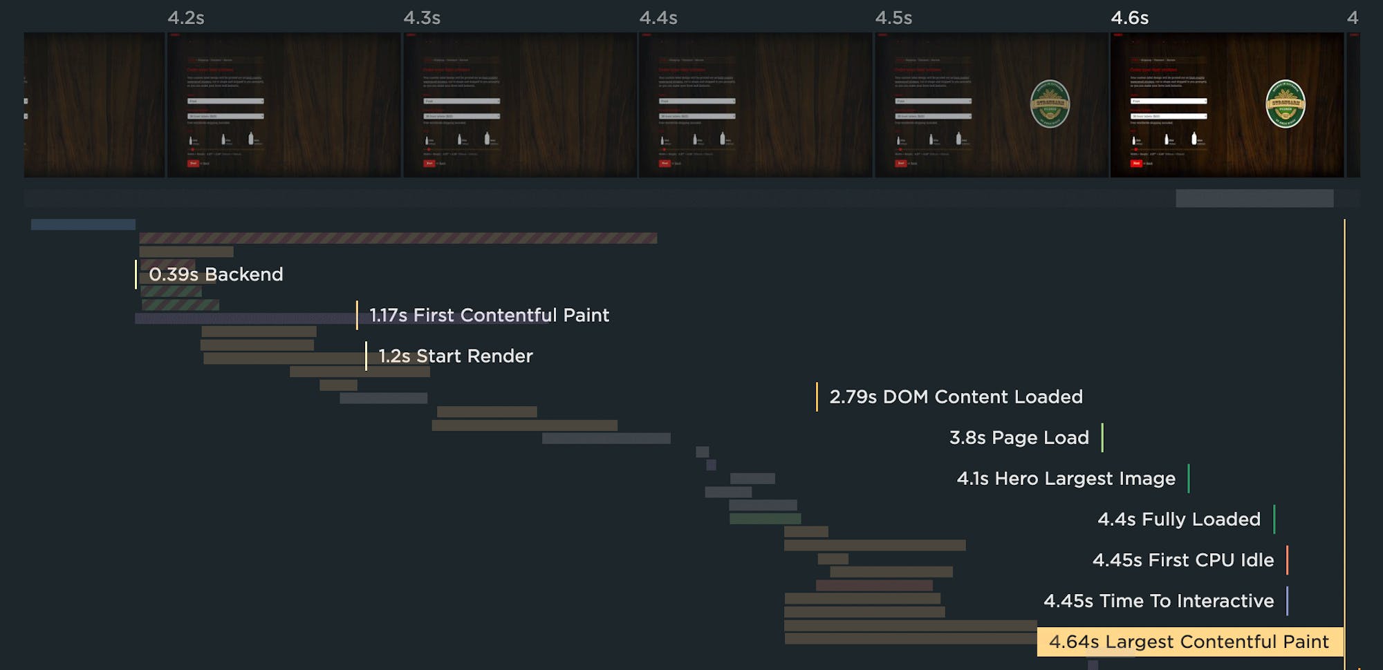
Looking at the chart above, you can see that Largest Contentful Paint happens at 4.64 seconds. But you can see in the filmstrip that the main visual element shows up earlier than that. Hovering over the Hero Largest Image metric (below) shows that it lines up with the main visual element.
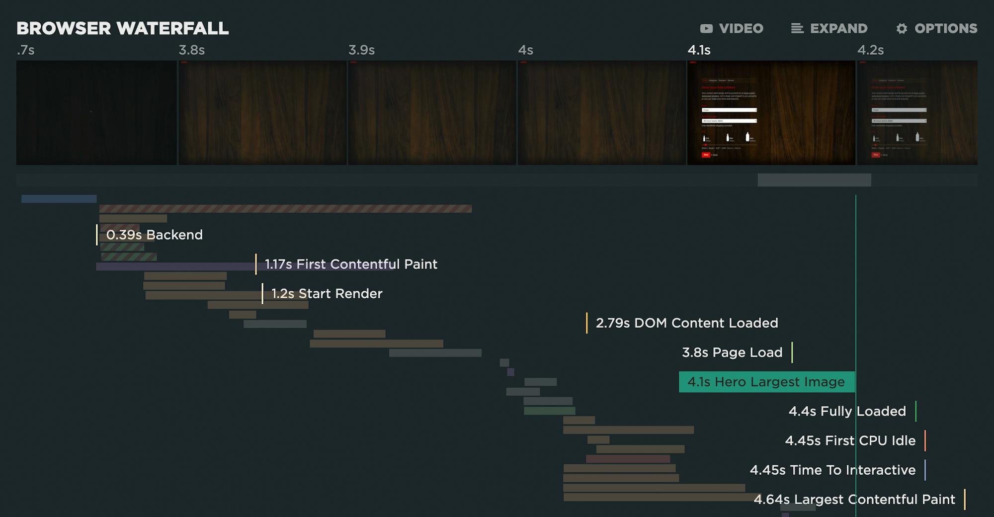
The takeaway here might be that, while tracking and optimizing LCP is important if you want to make Google happy, Hero Largest Image might be a good metric to track if you want a better understanding of what your users actually experience.
Visualize your performance issues
Your test details includes other helpful visuals, such as seeing the LCP element (framed in red) alongside other important rendering metrics, like Last Painted Hero and Visually Complete:
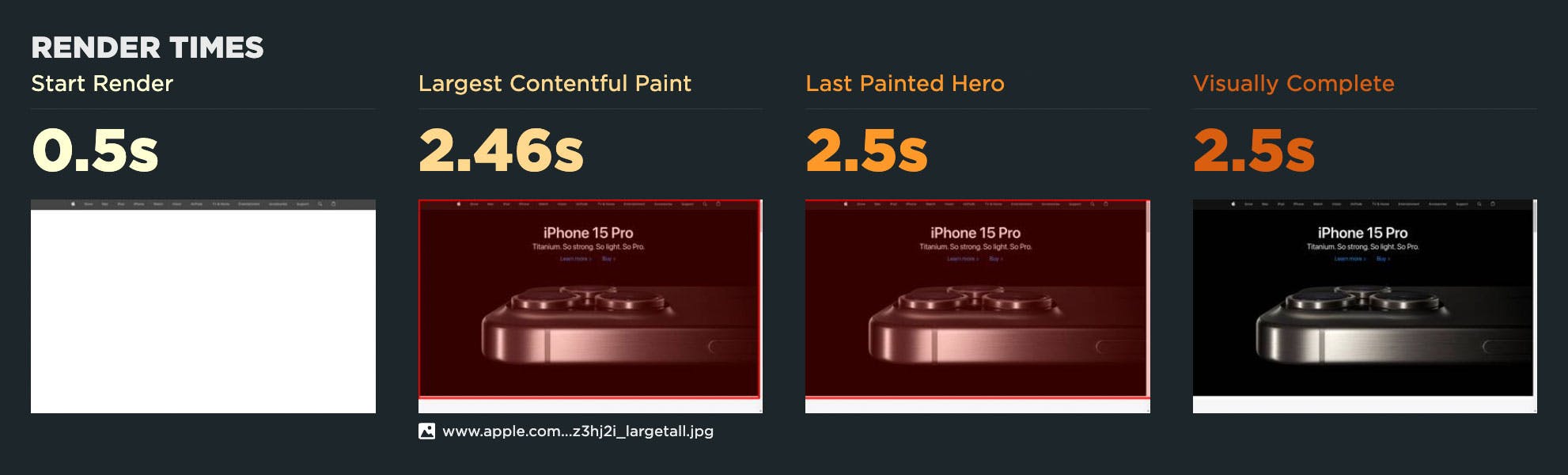
Cumulative Layout Shift is a notoriously tricky metric to understand. Visualizing all the shifting elements (within the red frames) on the page is extremely helpful. The more elements that shift – and the greater the movement – the more janky and unstable the page feels to your users.
(Pro tip: The most common CLS issue I see is that image elements don't have explicit 'width' and 'height' attributes. If you include those attributes, it's an easy way to make the image placeholders on your page stable and eliminate annoying jank.)
–––––
6. Get a prioritized list of optimization recommendations
Your Improve dashboard is an incredibly helpful tool. Consider it your very own performance checklist, aggregating and prioritizing all your Lighthouse audits and performance recommendations across all the pages you're testing.
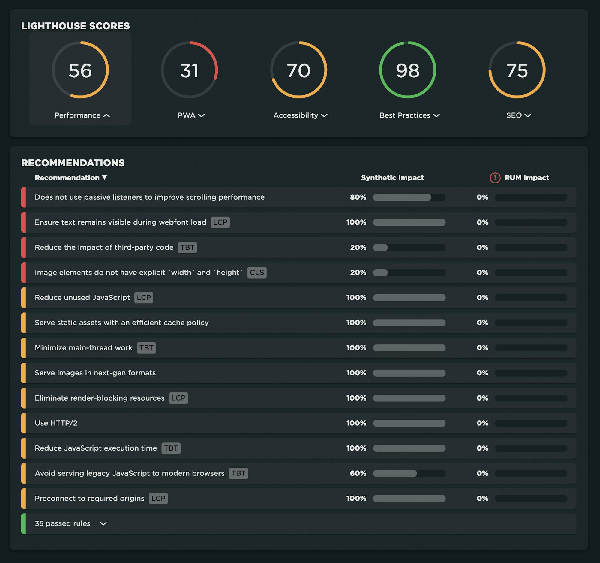
Not only does the Improve dashboard round up all your recommendations in one place, it shows you which optimizations you should tackle first. You can prioritize them by how many URLs they affect or how much of your real user traffic they affect.
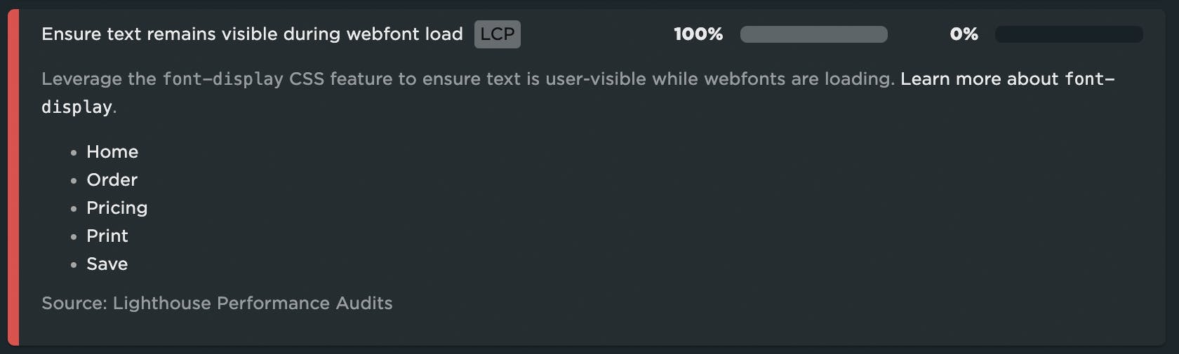
And because each recommendation is badged according to which Core Web Vital it affects, you can even get a sense of how your Vitals will be improved.
–––––
7. Bookmark and compare synthetic tests and RUM sessions
A huge benefit of tracking web performance over time is the ability to see trends and compare metrics. You can bookmark and compare different data points in your monitoring history, generating side-by-side comparisons that let you not only spot regressions, but easily identify what caused them:
- Compare the same page at different points in time
- Compare two versions of the same page – for example, one with ads and one without
- Understand which metrics got better or worse
- Identify which common requests got bigger/smaller or slower/faster
- Spot any new or unique requests – such as JavaScript and images – and see their impact on performance
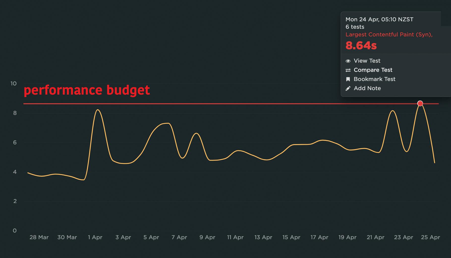
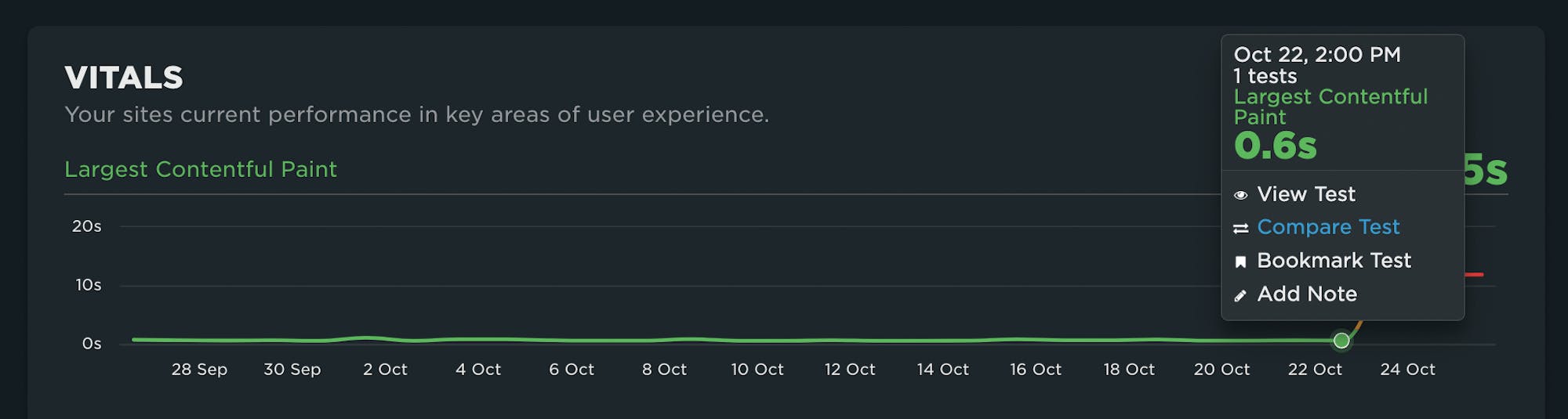
For example, if you see a spike in a metric, such as the LCP spike pictured below, you can click on that data point and select the 'Compare Test' option:
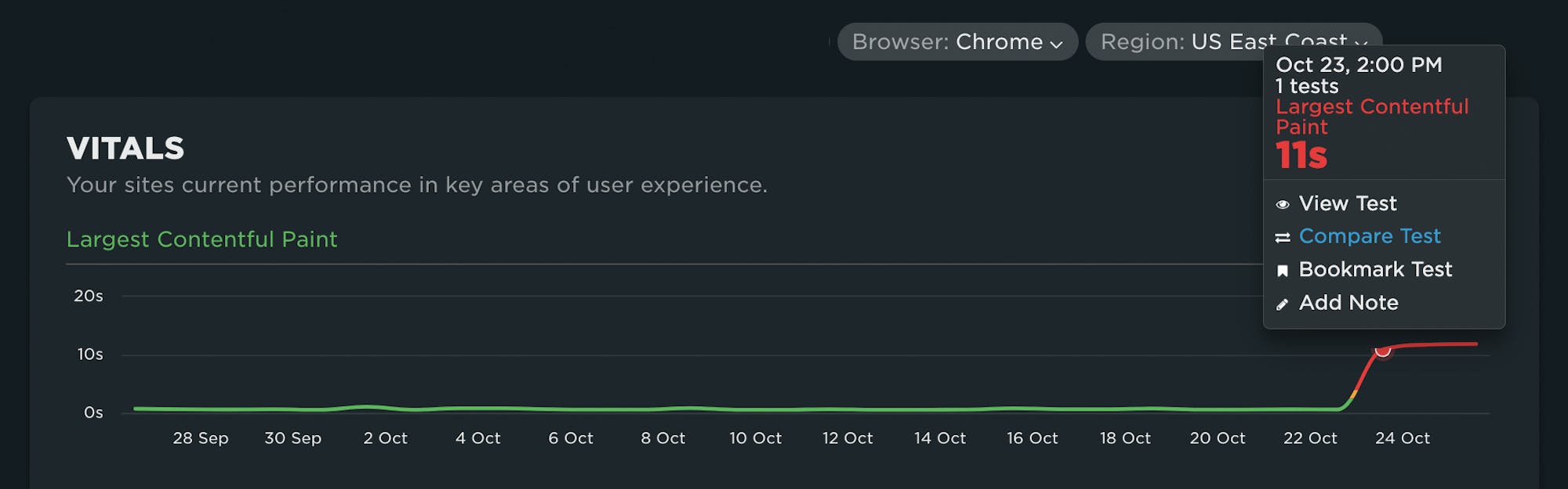
And then select a test with a better result:
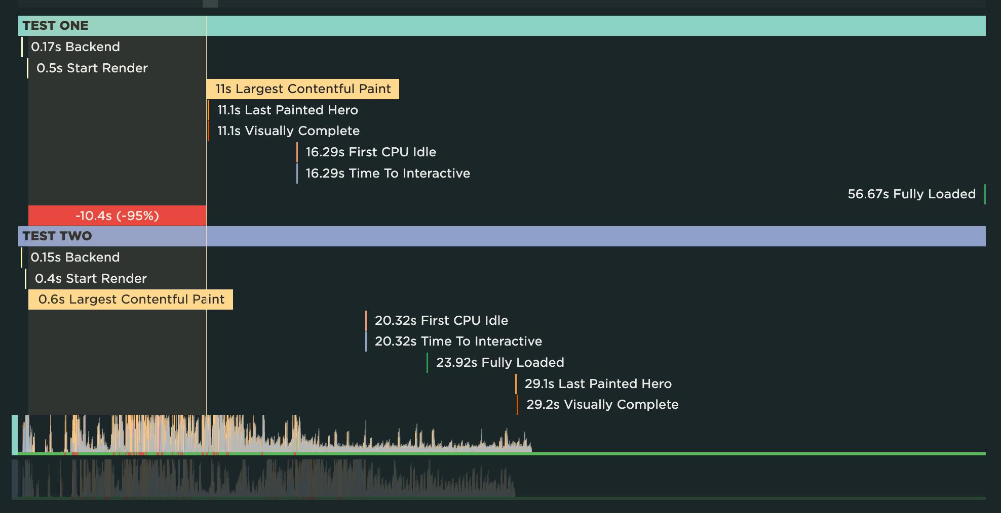
You'll get a tonne of comparison data, starting with a stacked waterfall chart of key metrics for both tests. You'll also get details on changes to common requests across both tests, as well as unique requests that may have introduced performance issues. This can help you quickly triangulate – and fix! – performance issues.
READ: How to bookmark and compare tests or sessions
–––––
8. Run A/B tests on design and code variations
With synthetic monitoring, it's super easy to benchmark not only your site versus a competitor's, but also variations of your own URLs. For example, you might want to test your site with ads turned on versus ads turned off. You can even turn off specific third parties to see how this affects your performance metrics. This sort of testing is usually referred to as A/B testing or MVT (multivariate testing).
READ: How to do A/B testing in Synthetic
You can even run A/B tests on your live site. This lets you understand the impact of design/code differences on the same page on your performance metrics – and even more interestingly, on real user behaviour. For example, this case study explains how we used RUM to A/B test JSONP requests and the preloader.
–––––
9. Generate customized weekly reports
You can easily turn any custom dashboard into an automated weekly report that gets sent to a mailing list you create. Here's an example of a weekly report showing week-over-week changes to Core Web Vitals:
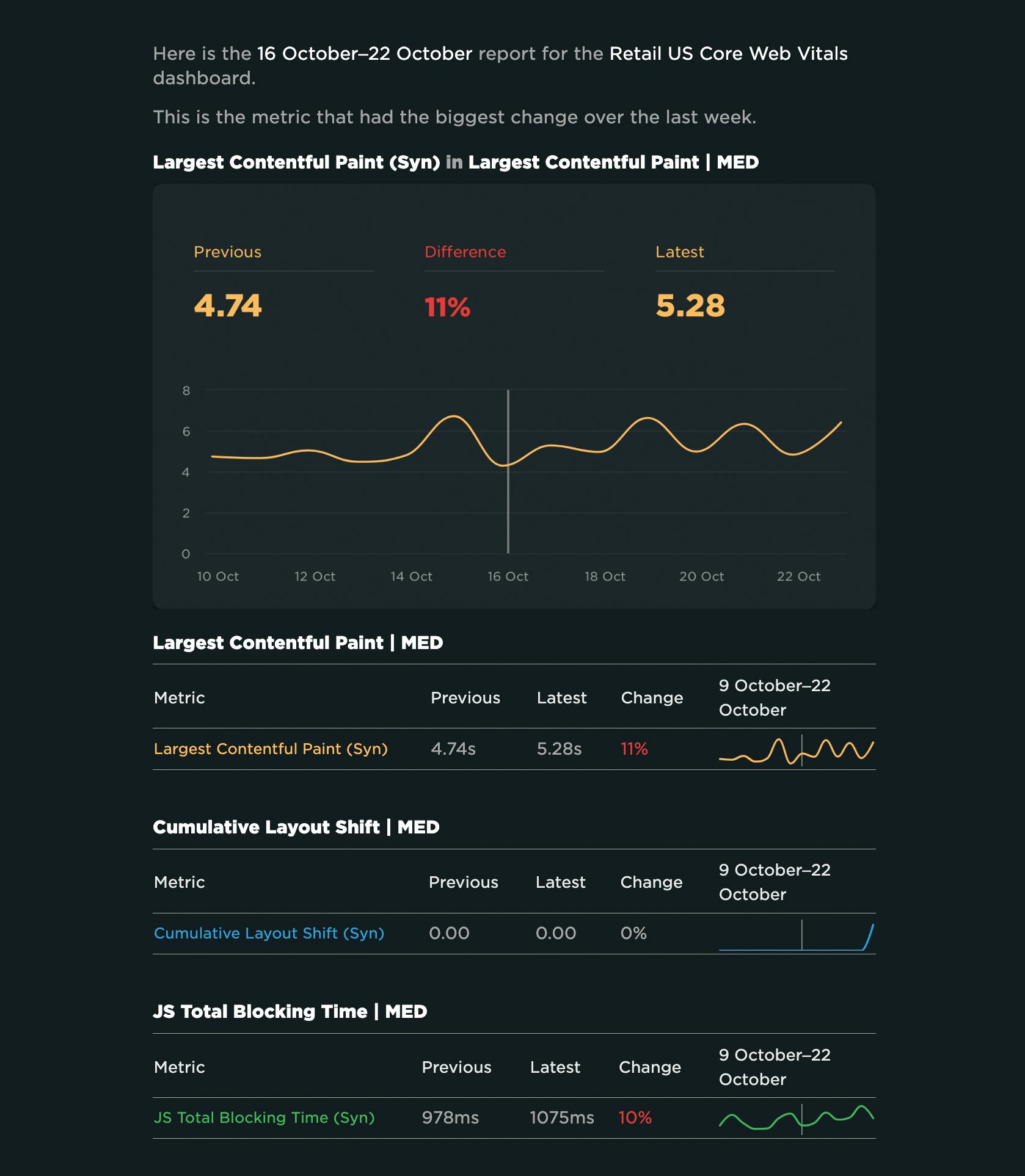
Your recipients don't need to have a SpeedCurve login. They can get everything they need from the report, which shows week-over-week changes and highlights the metric that had the biggest change. From the report, they can go directly to your SpeedCurve charts and drill down into more detailed results.
READ: How to enable weekly reports
–––––
10. Enable TV mode for dashboards
One excellent practice that's been used effectively by companies like Lonely Planet and Ticketmaster is to have monitors mounted in open areas of their offices, displaying key performance stats and comparison videos.
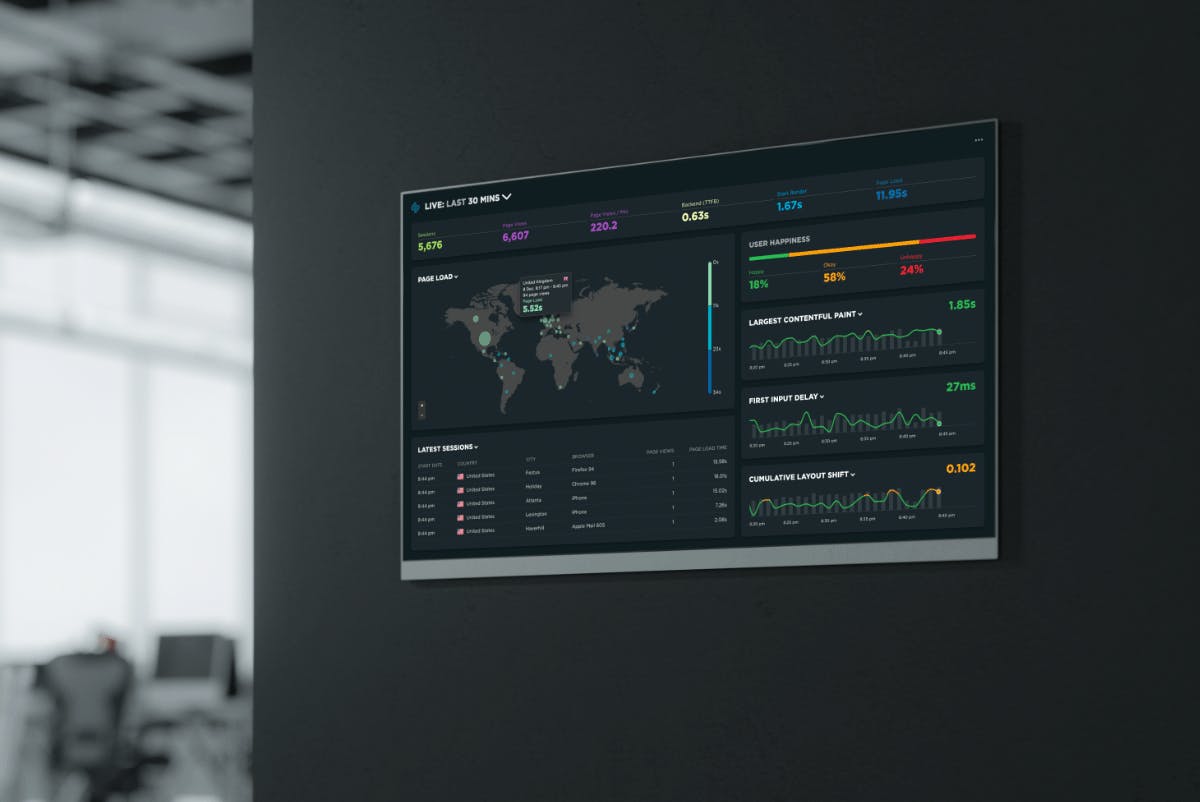
Lara Hogan (previously director of engineering at Etsy) wrote a great blog post demonstrating how Etsy took advantage of the power of showing versus telling.
READ: How to display your dashboards
–––––
A birthday gift for you!
Like hobbits, we like to give gifts on our birthday. To celebrate our tenth birthday, we’re offering an extra 10% off the first year for all new annual subscriptions – bringing your total annual discount to 30%.
Start your free trial if you haven't already, and when you're ready to subscribe, just follow the prompts.
(If you already have a SpeedCurve plan, we’re offering an additional 10% off your annual price if you renew for 2+ years. Email us at support@speedcurve.com for more information.)
These offers are available until December 31, 2023, so act soon!

Read Next
If you're not already using performance budgets to prevent regressions, you should be! Here's how to get started.
Want to truly understand the impact of site speed on your visitors and your business? Combine conversion data with performance data.