Does Interaction to Next Paint actually correlate to user behavior?

Earlier this year, Google announced that Interaction to Next Paint (INP) is no longer an experimental metric. INP will replace First Input Delay (FID) as a Core Web Vital in March of 2024.
Now that INP has arrived to dethrone FID as the responsiveness metric in Core Web Vitals, we've turned our eye to scrutinizing its effectiveness. In this post, we'll look at real-world data and attempt to answer: What correlation – if any – does INP have with actual user behavior and business metrics?
Core Web Vitals background
It's been more than three years since the Core Web Vitals initiative was kicked off in May 2020. In that time, we've seen people's interest in front-end web performance dramatically increase, especially in the world of SEO. It's been hugely helpful to have a simple set of three metrics – focused on loading, interactivity, and responsiveness – that everyone can understand and focus on.
During this time, SpeedCurve has stayed objective when looking at the Vitals metrics. When it comes to new performance metrics, it's easy to jump on bandwagons. While we definitely get excited about emerging metrics, we also approach each new metric with an analytical eye. (For example, back in November 2020, we took a closer look at one of the Core Web Vitals, First Input Delay, and found that it was sort of 'meh' overall when it came to meaningfully correlating with actual user behavior.)
What is Interaction to Next Paint?
Interaction to Next Paint (INP) is intended to measure how responsive a page is to user interaction(s). This is measured based on how quickly the page responds visually after a user interaction (i.e. when the page paints something in the browser's next frame after you interact with it). Because INP measures actual user interactions, it can only be monitored using a real user monitoring (RUM) tool.
For the purposes of INP, an interaction is considered any of the following:
- Mouse click
- Touchscreen tap
- Key press
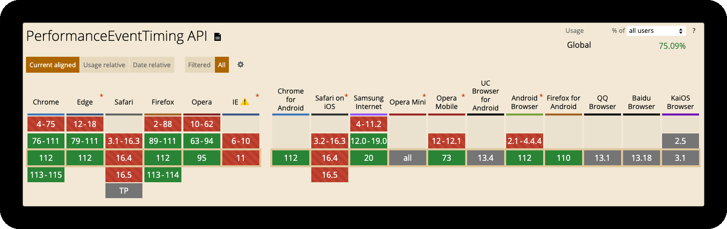
INP is measured using the Event Timing API, which is supported in Chrome, Edge, Firefox and Opera.
Alas, there is no support for INP in Safari. This is important to keep in mind if you – like a lot of site owners – have a significant amount of visitors using Safari. (Safari users currently account for roughly 20% of global traffic. In North America, Safari users represent almost one-third of all traffic.)
For a more detailed explainer of INP – including a breakdown of what's in an interaction, how INP is calculated and more – see this post by Jeremy Wagner from the Google Chrome team.
What is a 'good' INP number?
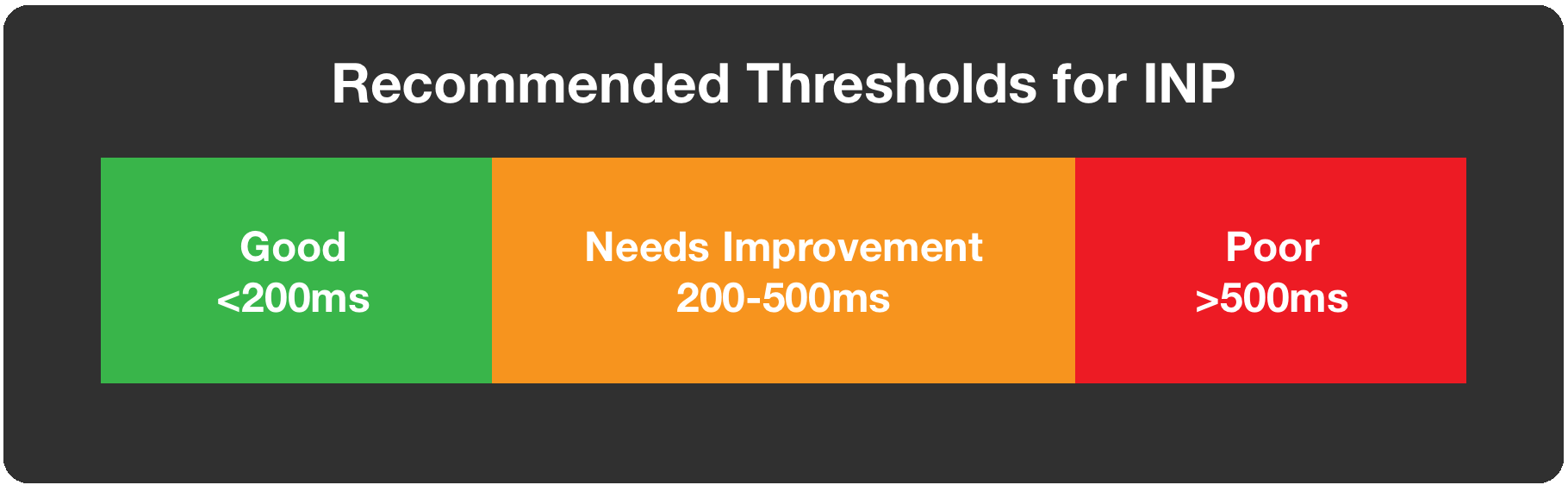
INP is a relatively new metric, so the suggested thresholds from Google are subject to change. For now, those thresholds are as follows:
- Good – Under 200ms
- Needs improvement – Between 200-500ms
- Poor – More than 500ms
Note that these thresholds are all based on RUM data at the 75th percentile. It's also important to note that these thresholds apply to both desktop and mobile traffic. (Learn why this is significant here.)
What can affect INP?
Most user interactions will take place after the page is initially loaded, so it's important to understand that the measurement is typically captured after most of your other metrics (i.e. FCP, LCP, Load, etc.) have occurred. Oftentimes the page seems dormant at this point, but this is not always the case.
Things that can affect INP include:
- Long-running JavaScript event handlers
- Input delay due to Long Tasks blocking the main thread
- Poorly performing JavaScript frameworks
- Page complexity leading to presentation delay
For some ideas around optimizing INP, I've included some great resources at the bottom of this article.
How does INP correlate with user behavior?
While understanding Interaction to Next Paint is important, does it really correlate with how users interact with your site? This is the most important question we should be asking.
It's easy to focus so intently on improving metrics, such as Core Web Vitals, that we lose site of the bigger picture. Creating a delightful experience for end users is at the heart of web performance.
Using correlation charts to track performance against business metrics
One way of understanding how metrics such as INP align with users is to correlate with outcomes, such as conversion rates.
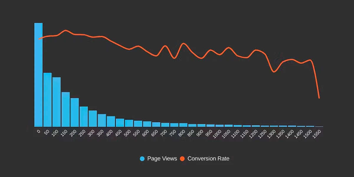
A correlation chart gives you a histogram view of all your user traffic, broken out into cohorts based on performance metrics, such as INP. The chart also includes an overlay that shows you a user engagement metric or business metric – such as bounce rate or conversion rate – that correlates to each of these cohorts. This lets you see at a glance the relationship between performance, user engagement, and your business.
Here is an example of how INP correlated with conversion rates for four different ecommerce sites. The blue bars represent the cohorts of visits, broken down by INP duration. The red line shows the conversion rate across those cohorts.
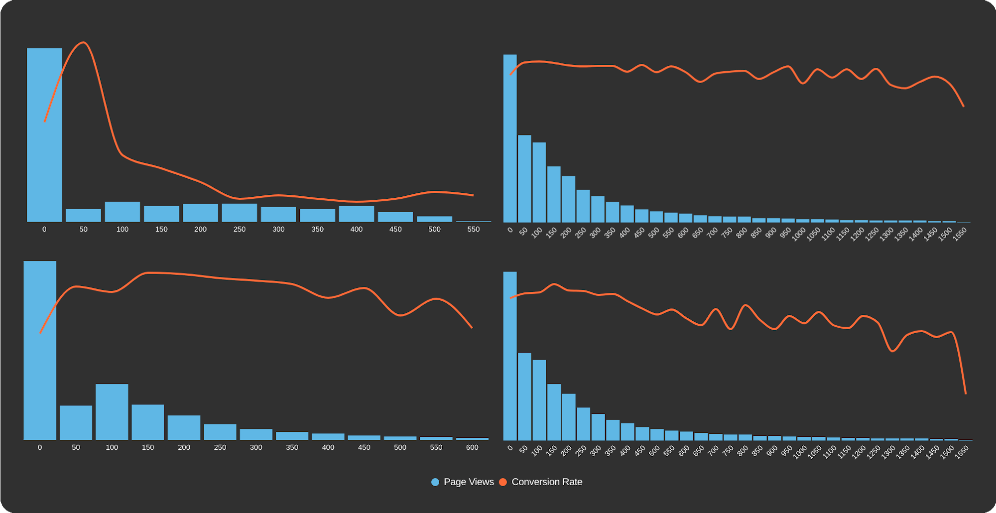
Observation 1: Results vary across sites
Not surprisingly, we see the impact is different based on the slope of the conversion line, as well as the distribution of INP across user sessions.
Observation 2: As INP gets worse, conversion rate tends to suffer
There is an overall negative correlation between Interaction to Next Paint and conversions. This tells us that yes, INP seems to be a meaningful metric when it comes to user-perceived performance.
Observation 3: There is no consistent correlation with Google's thresholds
There's no consistent correlation with Google's thresholds for "good", "needs improvement", and "poor". For example, for one site, conversions suffer when INP is 100ms, which is well within Google's "good" parameter of sub-200ms. This doesn't mean that it's not a good idea to have a general set of thresholds. It just means that those thresholds might not apply to your site. You need to look at your own data to confirm.
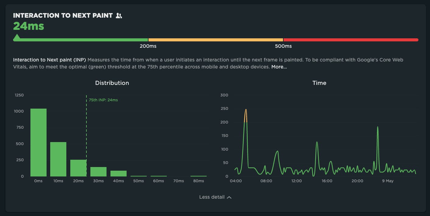
Measuring INP in SpeedCurve
We've added INP everywhere your Vitals are showcased throughout SpeedCurve – including the Home, Vitals, Performance, and JavaScript dashboards.
It's easy to create your own correlation charts in SpeedCurve. Out of the box, you can create charts that correlate Interaction to Next Paint with bounce rate. You can also add your own conversion data if you want to correlate INP to conversion rate. Either way, you'll get an understanding of how improving INP can help your business.
Resources
- INP Explainer
- Optimizing INP
- Adding INP to Favorites in SpeedCurve [video]
- Modern Frameworks and INP
- Core Web Vitals Changelog

Read Next
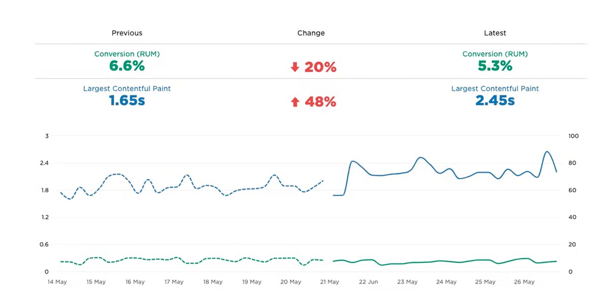
Want to truly understand the impact of site speed on your visitors and your business? Combine conversion data with performance data.

Only 65% of mobile sites have a good Interaction to Next Paint score. Why? How much does this hurt your business? And how can you fix it?