
We’ve all been there. An important fix is waiting to be delivered, and a manager asks you why it’s taking so long and says that the pipeline was much faster a few months ago. Although you disagree with the assessment, you can’t dispute it because you don’t have the data to show that the pipeline is not slower.
At Dynatrace, Jenkins is the most used Continuous Integration (CI) tool. It’s open source, allows for great scalability with the possibility to run workloads on the cloud and on-premises Kubernetes clusters, and is easily extensible via plugins.
To monitor these pipelines, OpenTelemetry can be used to trace every step of the build and send the traces to various backends. You’re probably already familiar with the view of a trace in Dynatrace, as shown below. If you’re also familiar with Jenkins, you’ll notice that the trace steps are the same as in your Jenkins builds—you get a one-to-one mapping.
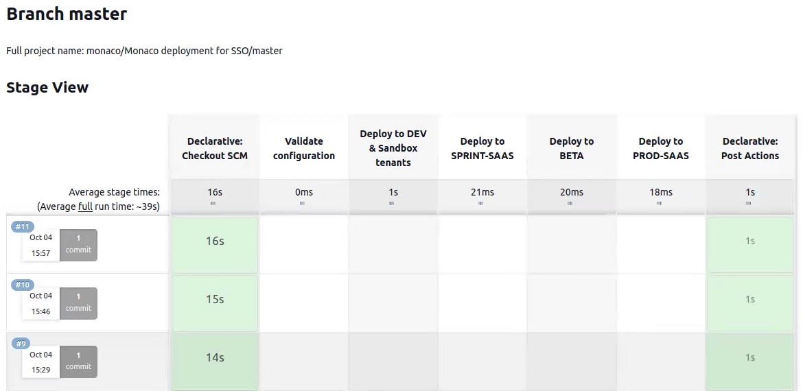
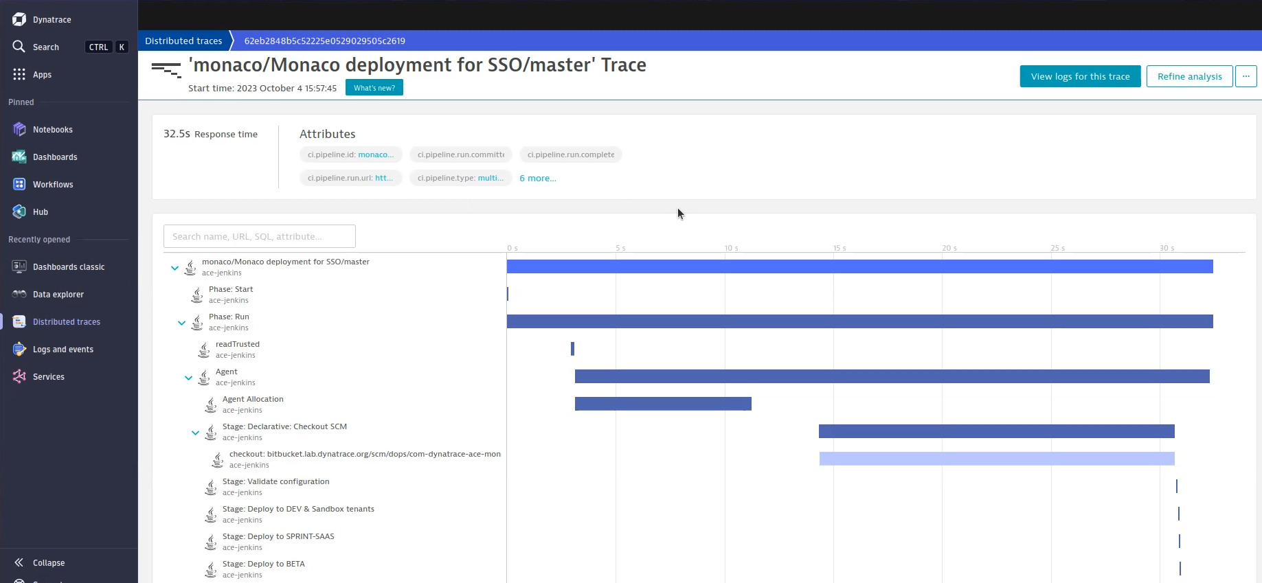
In this trace, we see that the checkout took up a large portion of the build. The question is, what can be done with this data? How can you show things like the failure rate of a pipeline during the last two weeks with as little effort as possible?
What we measure at Dynatrace
It’s important to agree upon what should be measured; there is no right or wrong answer here. At Dynatrace, we measure the DORA metrics from Google.
These include:
- Deployment frequency: How often is code deployed?
- Lead time for changes: How long does it take to get committed code into production?
- Time to restore service: How long does it take to restore a service?
- Change failure rate: How often does the service fail following changes?
While tracking the time to restore a service and the change failure rate require an issue management system, the first two metrics can be acquired by looking at the pipelines.
Unified services: Easy, out-of-the-box service visualization
If you use GitHub or GitLab, you can use the Four Keys project (https://github.com/dora-team/fourkeys), which can be integrated into your project, or you can write your own service that takes the OpenTelemetry data and executes the necessary operations on it.
But if you want to get everything out of the box, you can use Dynatrace unified services. This service visualization experience for OpenTelemetry was introduced with Dynatrace version 1.274. As soon as you have unified services enabled on your Dynatrace tenant, your OpenTelemetry API-ingested services will look like the image below.
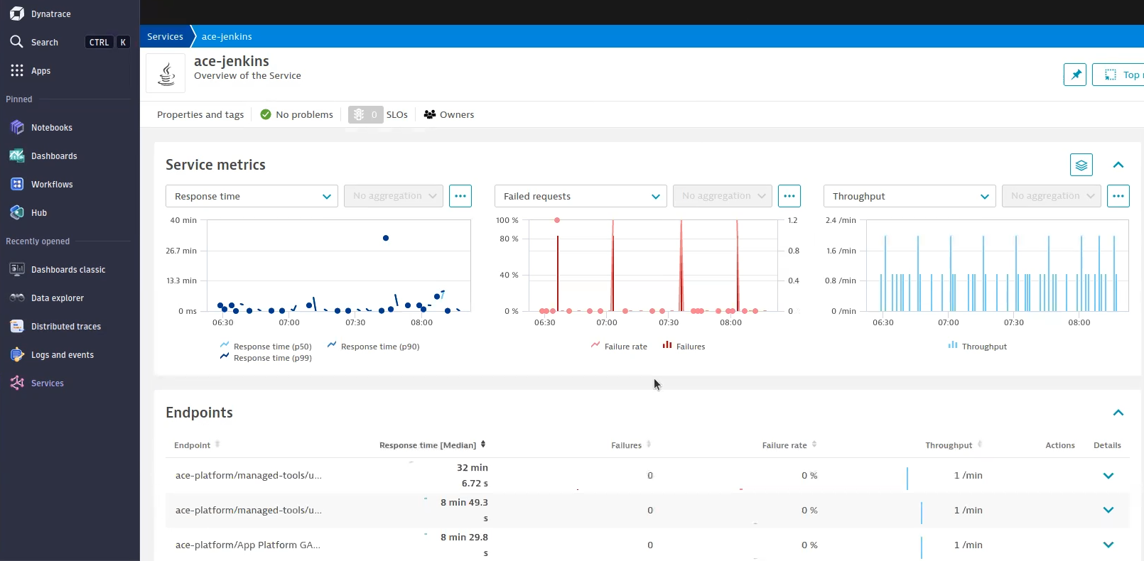
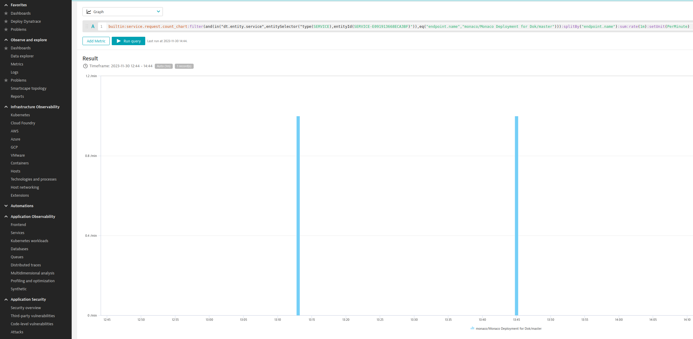
There’s an endpoint for each branch that exists within Jenkins. You get the number of failures, the throughput, and the response time, which maps to the duration of the build.
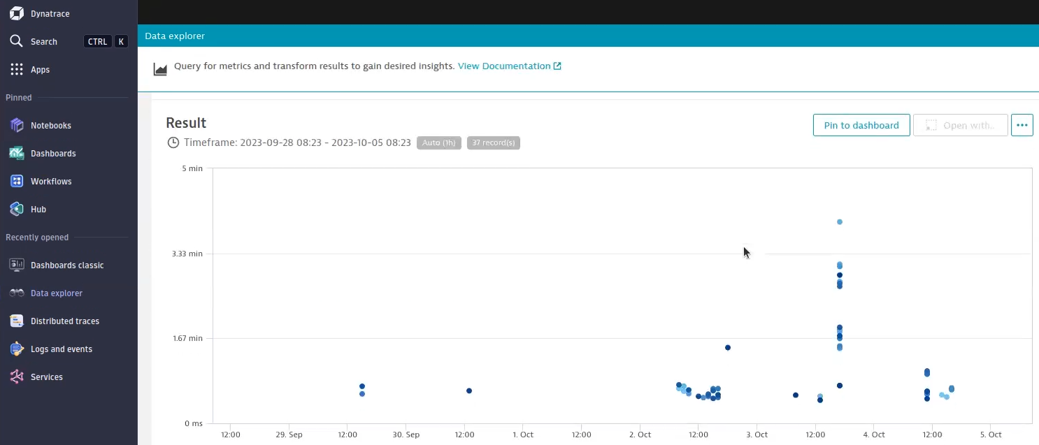
Now, let’s jump to a real-world example. Let’s say that your developers believe that their pull requests sometimes take longer than usual, not a lot, but a noticeable amount. And sometimes, the pull requests aren’t triggered at all. In such a scenario, check the durations of all the pull requests. In this case, we can see a clustering of pull requests and some outliers. With this information, we can guess that the webhook to Jenkins isn’t correctly configured, and only when the pipeline is scanned on Jenkins are the PRs picked up.
Normally, you get one endpoint per pull request, but as you can see, we summarized all the pull requests into one chart. This can be achieved by adapting the query a bit.
builtin:service.request.response_time_chart:filter(and(eq("dt.entity.service",SERVICE-AE4EB9E449B856CA),eq("endpoint.name","EP/backstage/PR-156"))):splitBy("endpoint.name"):median
You can adapt the equals to a contains and remove the PR number from the endpoint name and you get data for all pull requests in one chart.
builtin:service.request.response_time_chart:filter(and(eq("dt.entity.service",SERVICE-AE4EB9E449B856CA),contains("endpoint.name","EP/backstage/PR-"))):splitBy("endpoint.name"):median
Now, let’s say we want to check the Backstage pipeline. The first DORA metric is rather easy; we simply look at the throughput of the main branch. You can view the throughput in the Dynatrace Data Explorer, which translates to the number of builds that ran. In the view below, you can see the number of builds in the last two hours.
To learn the amount of time it takes until a commit appears in production, you need the duration of pull requests and the duration of the main branch. The chart below shows you the duration of builds on the main branch.
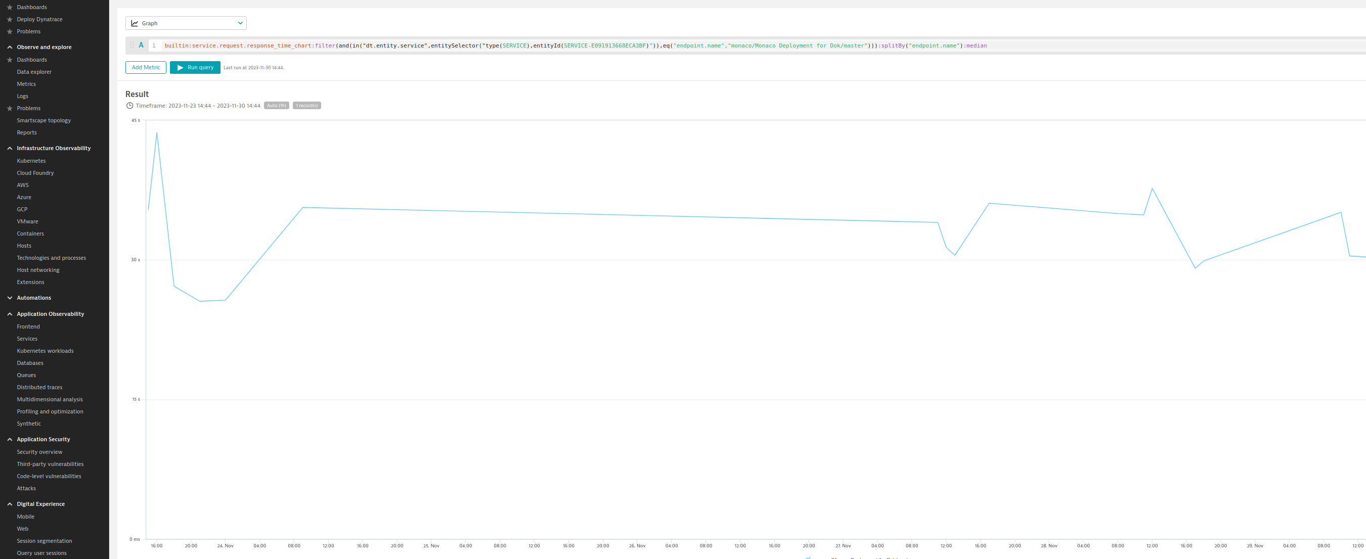
The chart for the main branch works out of the box. For the pull requests, we must adapt the query a bit, because based on the built-in rules that come with the unified services, they create a new endpoint for every pull request, which allows for exact control, but this is not what we want in this case. So, we will leave the query as-is .
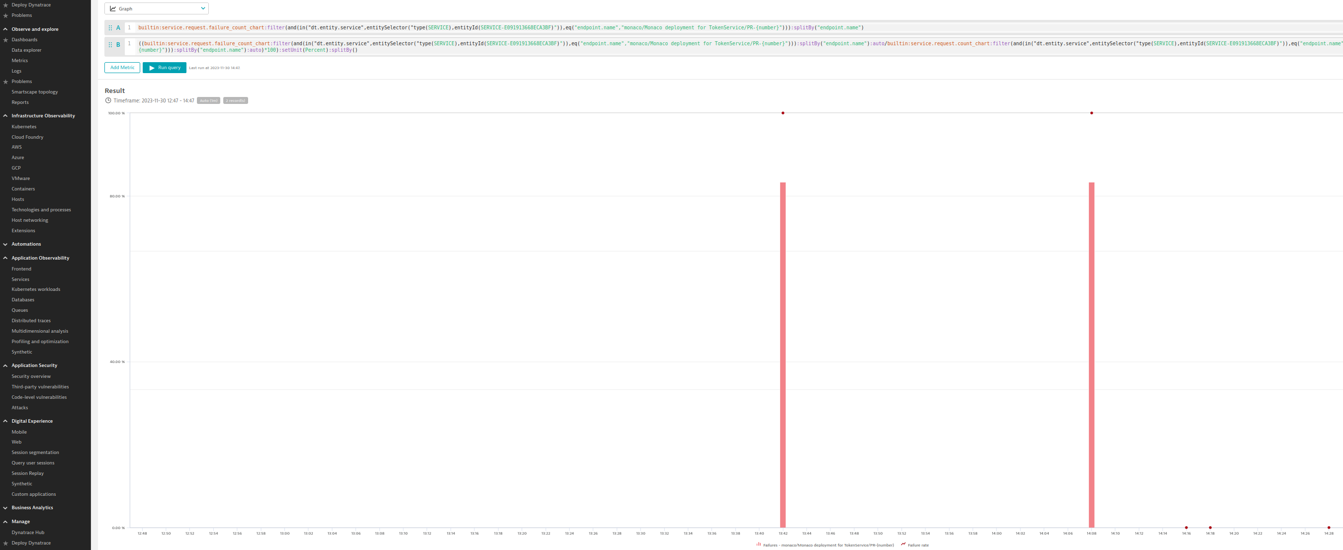
One last thing that you might be interested in is the failure rate of the main branch. As with the other metrics, simply search your main branch, view the data in the Dynatrace Data Explorer and be happy that your main branch only broke twice in the last seven days.
Sneak-peek time!
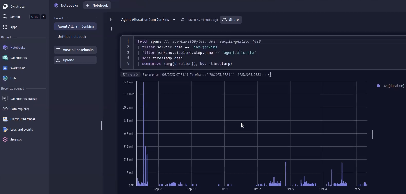
While Traces powered by Grail™ is still in development, we already use it for internal use cases and can give you a sneak peek. With a simple Dynatrace Query Language (DQL) query, we can filter for each and every step of a trace, or as is the case in this example, a Jenkins pipeline. As you can see, the allocation times look fine, but there is a huge outlier. This outlier points us to an overloaded cloud; too many workloads were running, and the cluster ran out of resources. Therefore, the pods had to wait a long time to be spawned. With this data in hand, we don’t need to rely on a gut feeling—you can now back up your report with data.
See the current state of your pipeline at a glance
With Dynatrace unified services, you can assess the state of your pipelines at a glance and can make confident statements based on data and not your gut feelings. You can now provide answers to tough questions like “Are the pipelines getting slower?” or “Are my builds breaking more often?” Another big advantage is the fact that once you have the services enabled, you have the data available all the time and no longer need to search when new questions arise. If you want a deeper look into this topic, watch Dynatrace Tips & Tricks #18 – Jenkins Pipeline Analytics with OpenTelemetry.
Try it yourself
Using Jenkins? The following links help you to export the traces from Jenkins and to ingest them into Dynatrace.

Looking for answers?
Start a new discussion or ask for help in our Q&A forum.
Go to forum