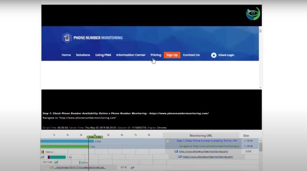
Waterfall charts are diagrams which represent how website resources are being downloaded, parsed by the engine, in a timeline that gives us the opportunity to see the sequence and dependencies between resources. It assists in identifying where important events happened during the loading process. They can also let the user easily see how good or bad the performance of their website is, showing you exactly what is slowing down your site.
Waterfall charts within the Dotcom-Monitor platform can help users identify where important events happened during the page load process. Waterfall charts let us see a cascade effect over several tasks, and in the matter of a few seconds, the user can see how bad/good the performance of the website is, such as how many resources are blocking parallel downloads or how many rows exist. The user has the summary on the device, with descriptive visualizations of device statistics on pie charts. Users can also watch the actual URL loading video in the browser window.
The screenshot below is a sample of a waterfall chart of amazon.com to introduce what waterfall charts look like. As you can see, there are a lot of different elements that come into play during page’s load time. Some of those factors include the following:
- URL
- Test Location
- Browser (Chrome, Firefox, Internet Explorer, mobile browsers etc…)
- Connection
- Number of Tests
- Repeat View

Elements Used in Waterfall Charts
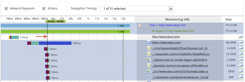
Interactive Slider: The Interactive Slider is an indicator of the performance of each element in terms of milliseconds. In the image below, it is pointed at with the arrow. The user can drag the interactive slider to see which element is being loaded, and in what point in time. In this screenshot, you can see the highlighted elements are being loaded in the 531st millisecond.
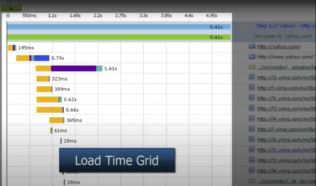
Load Time Grid: The highlighted area below is called Load Time Grid. It shows how much time it takes to load for each element.
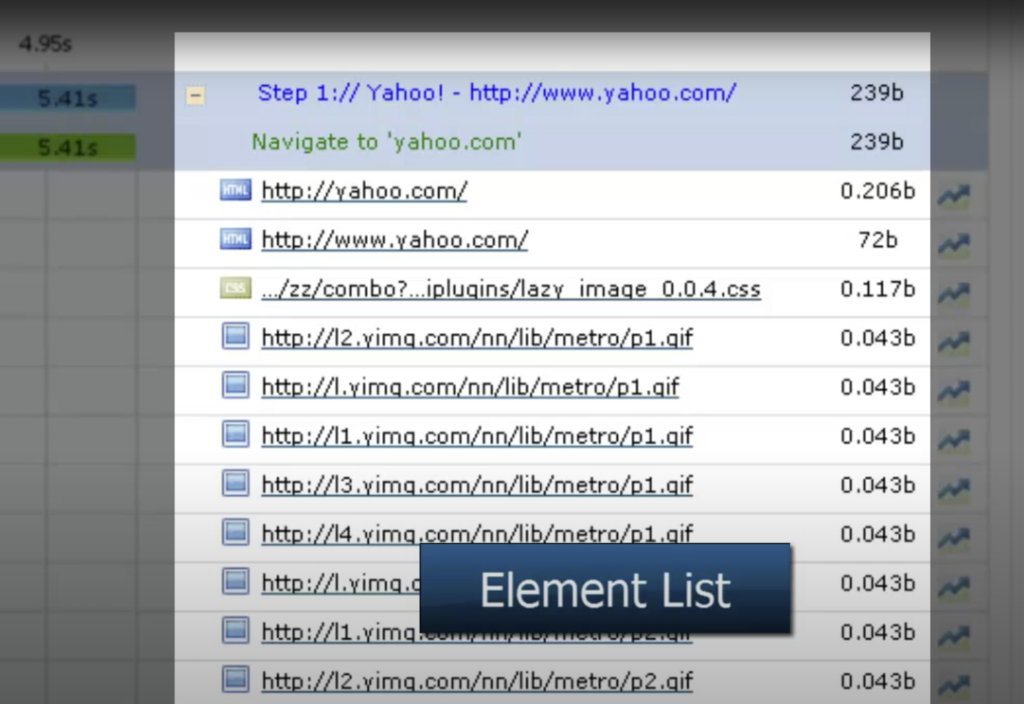
Element List: The elements exist in the web page is shown in the Element List. The element’s extension can be HTML, CSS, GIF, etc.
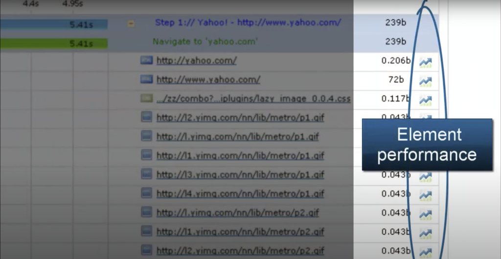
Element Performance: A user can reach the information of the performance of each element that exists in waterfall chart.
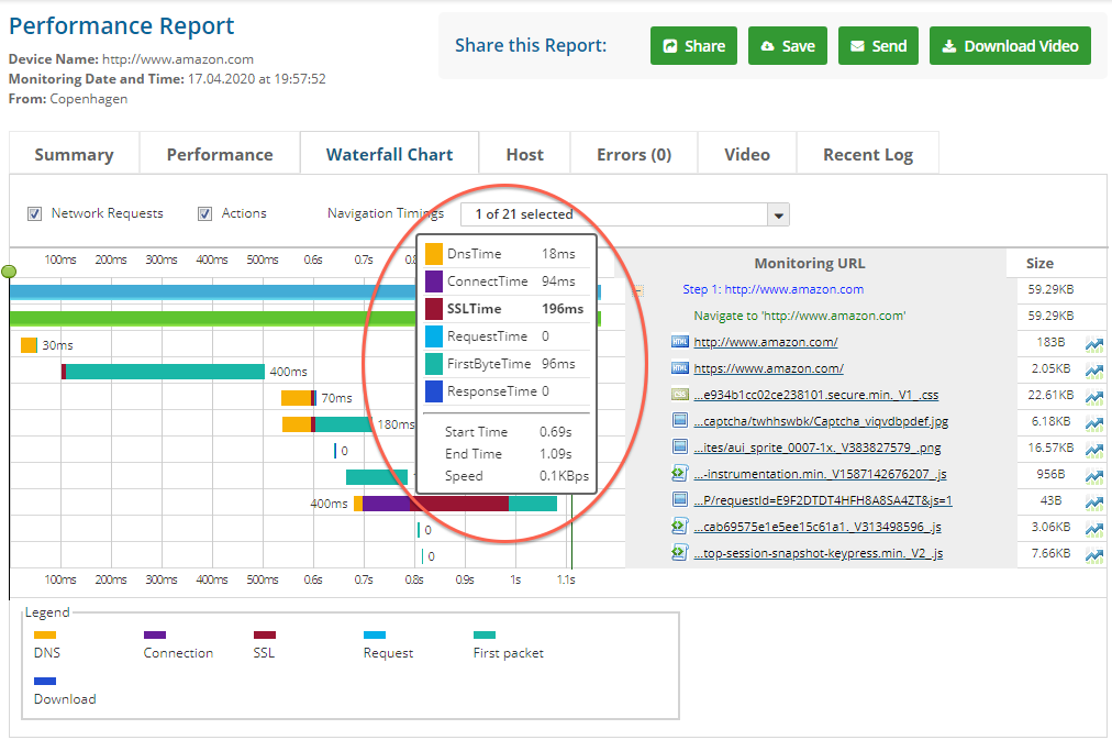
When the user clicks on the specific element button, they are welcomed by a performance page, shown below.
 By analyzing the performance page, the user has a deeper knowledge about the response details. They can select the desired are and release mouse button to display details. The user can also observe the performance issues by paying attention to the red marked area, which means there is a performance down period.
Load Time Details For Individual Elements: In the waterfall chart, when the user moves their cursor on a specific bar, he is shown a load time details which are DnsTime, ConnectTime, SSLTime, RequestTime, FirstByteTime, ResponseTime, StartTime, EndTime, Speed which is pointed in a red oval.
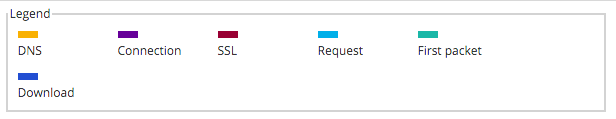
Explanation of Color Coding: Within in Dotcom Monitor platform, representation of load time details are defined by the following colors:
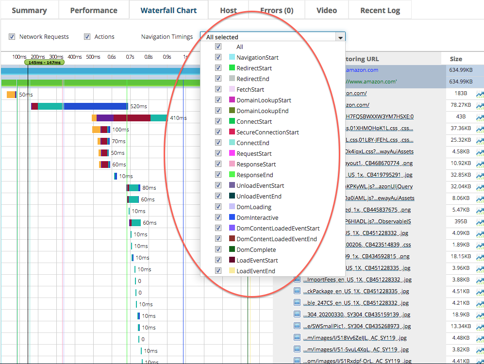
Navigation Timings: They can be shown as a column in the waterfall chart to show the Navigation Start, Redirect Start, Redirect End, Fetch Start, Domain Lookup Start, Domain Lookup End, Connect Start, Secure Connection Start, Connect End, Request Start, Response Start, Response End, Unload Event Start, Unload Event End, DOM Loading, DOM Interactive, DOM Content Loaded Event Start, DOM Content Loaded Event End, DOM Complete, Load Event Start, and Load Event End with color coding (shown below within the red oval).
It’s important to mention that within the Dotcom Monitor platform there is a feature that a user can watch the actual URL loading video in the browser window (shown below).
Optimizing Web Performance by Understanding Waterfall Charts
Performance and speed of a web site plays a tremendous role. If your website isn’t fast enough, the user will not wait for it to finish loading. A fast website increases conversion rates and leads you to perform well on search engines. To understand the speed of your website, waterfall diagrams are used. Waterfall charts help you to identify the problem source and are a great way to diagnose what’s slowing down your web pages.
In a waterfall chart by looking a size of a file which is more than 1MB may cause your site to slow down. With the help of the timeline in the waterfall chart, the user is able to discover the different phases of resource loading and understand which phases slow their website down. Some of the phases are presented below:
- Receiving. The time it takes to download files. This is the first phase of the timeline. Large files, such as non-optimized images, delays the download time and absorbs more bandwidth, causing a delay on the website. The solution for this specific problem is that the user should optimize media by reducing the size of the images without lowering their quality. To boost the bandwidth availability, the user should keep the images on a cloud server.
- Waiting time. The time captured by the server to produce a response. If the waiting time is too much, it may mean an overloaded network server or there may be an inefficient code, which must be fixed by software developers by finding the bugs and correcting the code. Moreover, caching utility may decrease the waiting time. In that case, the user should shift from shared hosting to dedicated hosting.
- Queued request. Consists convenient connections HTTP/HTTP2, HTTP authentication, execution of CSS or JavaScript, SSL connect time, is an important phase of the timeline.
- DNS lookup. Consists the time for the DNS to resolve and gives the user a big clue what is slowing down the website. In general, most of the scripts are slowing the websites down due to DNS lookup.
When the user identifies the issues that are slowing down their web page with the help of waterfall charts, they can begin to come up with a solution to the problem. Some of the problems and their solutions are represented below.
| Issue | Solution |
|
Page tracking link |
Uninstall or remove the tracking tool that is in use |
| Slow DNS lookup | The user may use a CDN |
| Slow server end | Send an email to your service provider. |
| Error due to plugins | The user may uninstall the plugins. |
| Unused/bulky theme customization | The user may hire a web developer |
Even abeginner user can quickly understand the specific reasons that are slowing their website down by observing the waterfall charts. For example, long bars means the related element takes too much time to load, red text means an error fetching data, and long gaps between bars means times when there are no requests.
How to Make Websites Load Faster
By using waterfall charts, we can create a great user experience by making a web page load faster.
Decrease the Width of the Waterfall
Website performance can be improved by reducing the amount of time it takes to download the resources which leads reduce the width of the waterfall chart.
If there are long purple bars in the waterfall chart. Purple means time spent performing an SSL/TLS negotiation. In case a user faces with purple continuously, it means the website is not optimized for TLS. The user must optimize TLS performance.
If there’s a lot of orange in the waterfall chart. Orange means the initial TCP connection made for your website. Only 2-6 requests to a specific hostname should create a TCP connection. After 2-6 requests, the existing connections are reused. When a user is faced with a lot of orange, they must understand that the website does not use persistent connections. When persistent connection is made, the width of every request will be half since the web browser is not going to make new connections with every request.
If there are long blue bars in the waterfall chart. Blue color means time spent downloading the response. If there is a long blue bar, there’s a strong likelihood it’s because the resource is too large. Reducing the file size of the file can help solve the problem. A user can decrease the size by image optimization or HTTP compression.
If there is too much green the waterfall chart. The green color means the browser is waiting to get content. To reduce the green, the user should move the static content to a CDN.
Decrease the Height of the Waterfall Chart
Website speed can be improved by decreasing the number of requests the browser needs to perform to load the web page, which leads to decreasing the height of the waterfall. The user must review all their content within each page and decide if they really need it at all.
If there are too many JavaScript/CSS files that are less than 2kb. The user must involve the contents of those files directly in the HTML via inline, , or
tags.
If there are too many JavaScript/CSS files in the waterfall chart. The user must combine them with CMS plugin or as part of a build process. This action will decrease the number of requests made, increase page speed.
If there are too many 302 redirects. Yellow rows mean redirects, which mean links on the page are mistakenly made or outdated, which create unnecessary redirects that increase the height of the waterfall. The solution is to replace those links with direct links.
Increase Render Time
To improve rendering time, the user should optimize the ordering of resource requests, which moves the green Start Render line to the left.
If there are too many requests for separate CSS files. Before browsers start rendering the page, they wait until all the CSS is downloaded. The user should inline or combines those CSS files.
If a user sees calls to load JavaScript libraries. JavaScript includes may block page rendering. The user should move these lower in the page.
If a user sees external fonts. Until the browser downloads the external font, it does not draw anything. The user should avoid using external fonts.
First Visit and Repeat Visit. What is More Important?
Based on the user´s visit, there can be two types of waterfall charts created: First Visit and Repeat Visit. What’s the Difference?
Empty Cache (First View): The user access the website for the first time and has no cached data. Typical browser-based tools are going to clear the cache before making the requests. In other words, people are visiting the website for the very first time.
Cached Mode (Repeat Visit): The user access the website for the second time, emulating a second visit from the user’s perspective, which includes all the files now cached in a local storage. In other words, because people visited your site beforehand, now they may have your images, CSS cashed in their browser so the system doesn’t have to deliver much to them.
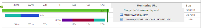
In the screenshots below, you can see how different the first visit waterfall chart and the repeat visit waterfall chart are.
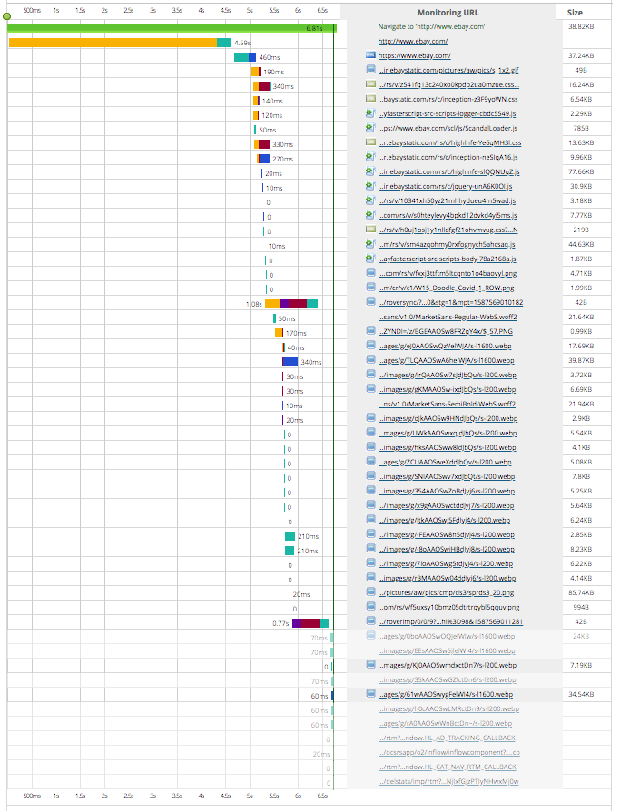
One of the important things to realize is that the empty cache takes 6.8 seconds to load, while the repeat, which which is a cached mode, takes 1.9 seconds.
If the website is performing well, it will be the same case in terms of comparing timings, with empty cache taking more time than cached version. The reason is in the first visit, tools will empty the cache before making the requests, and in the repeat visit, the system will have the files that can be cached in a local storage, leading to a shorter time to load the website.
Cached Mode (Repeat View) chart has fewer rows, meaning that many fewer resources were loaded. This is a good example of a website where efficient caching being used.
Without changing anything on the site, the repeat visit would be responding faster because of the elements being cached. First time visit would take more time than the repeat visit. If something is wrong on the website, which slows the website, the user corrects it. And they test the website again. They considers factors like geo-location, CDN servers, and PoP (Points of Presence). They can see from waterfall charts which element is slowing down the process. Maybe the website is using too much CPU. After correcting it, they can test the website again.
First time visit is important because the user understands how much time it takes to download the pictures and other resources. The repeat visit is also important because after the caching process, the user should evaluate how much time it takes to load the remaining items. Moreover, the user observes which resources are cached by looking the waterfall charts from the first visit and repeat visit. This is how a user can understand the performance of the website and content issues with resources.
Want to see what elements could be slowing down your website? Run a free website speed test and view your results through waterfall charts and performance reports.
How to Use a Waterfall Chart to Monitor Your Proper CDN Distribution
A Content Delivery Network (CDN) is a geographically distributed group of servers optimized to deliver static content to the end users. This static content can be almost any sort of data, however CDNs are generally used to deliver web pages and their related files, audio, streaming video, and large software packages.
CDN Utilization
A CDN’s edge servers enhance speed by bridging the gap between website resources and its visitors. Instead of making requests directly to a web site’s origin, users connect to the several CDN distribution platforms the provider has. The closer a request travels, the more time is saved. Moreover, CDN hosting accommodates file compression that improves overall browsing because smaller file sizes equate to faster loading speeds.
Using Waterfall Charts for Monitoring CDNs
In the screenshot of a waterfall chart below, the Monitoring URL area represents the list of all individual elements, along with their size and performance to the right.
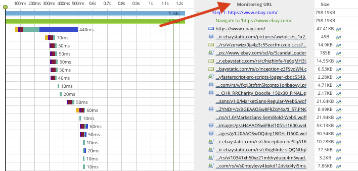
If the user is leveraging a CDN, they may see many files and resources coming from that one source – which is one way to determine if the CDN is configured properly.
Do You Need a CDN?
Waterfall charts allow the user to discover how latency is influencing the speed of the website. Going back to the color-coded chart earlier in the article, the yellow bar means the web browser is waiting for data from domain name server (DNS). Generally, 100ms waiting time is accepted as normal while 400ms is considered as slow. When there is a speed problem, it can be interpreted as a resource taking too much time to download or its size being too large. Moreover, it may mean that the transfer speed of the web server is too slow. For this specific problem, using CDN could be a solution to decreases the wait time.
Additionally, if the user experiences too much wait time to get a response, it may mean that the website’s content is physically farther away from the visitor. To be able to decide whether there is a need for CDN, location of the server must be known. For this, a platform like Dotcom-Monitor can be utilized to monitor a location furthest away from your server. Review the waterfall chart and the rows for requests and resources. If the waiting time is more than 100ms, the user should consider using CDN.