
It’s been a while since my last blog article on managing Dynatrace Managed at scale. Sorry for the readers who kept waiting for the next part – thanks for all the feedback and questions I received! In the fourth part of the series, I’ll show you how I used Dynatrace’s raw problem and event data to find the best fit for optimized anomaly detection settings.
If you haven’t already read the first three parts of this series you can recap on them through the links below:
- Part I: Managing Dynatrace Managed at scale
- Part II: Managing the Dynatrace API across multiple thousand environments
- Part III: Keeping track of thousands of environments from 20,000 feet
We know Dynatrace’s AI – Davis® – already does a good job reducing the alert noise. However, you might still want to tweak the out-of-the-box anomaly detection settings to match your requirements even better. Usually, in single environment setups, you would do that by adjusting parameters step by step and adopt as you learn more until you find the combination that works best for you. But that didn’t work for me. I took a big-data-analysis approach, which started with another problem visualization.
Visualizing problem noise
During the implementation of the real-time visualization I presented in part three, I had an idea for another visualization; I wanted to visualize the number of detected problems globally, for a longer timeframe. This would allow me to get an idea of the status in the past seven days. I also wanted to analyze if Dynatrace’s problem detection was creating too many problems or “noise”.
Bear in mind this setup covered a few thousand environments out of which we automatically created support tickets for several hundred environment’s problems. Ultimately I wanted to avoid creating too many tickets in our ITSM solution. I wanted to understand how I could tune Dynatrace’s problem detection, but to do that I needed to understand the situation first.
To achieve that I took two approaches:
- Visualizing historic problem data via a “Swimlane Visualization”
- Statistically analyzing Dynatrace’s event and problem data
What is an unhealthy environment?
Before I dive into the visualization I chose for (1) I need to explain how I define the “unhealthy” state of a monitored environment:
- Whenever Dynatrace detects at least one problem I consider this environment as unhealthy – meaning it needs looking at or action to be
- If at least one problem is open the environment stays unhealthy
Why am I explaining this? This is required for understanding how I intend to improve the efficiency of (manual) alert ticket handling. Imagine traditional support operations: for every alert detected by a monitoring system, a ticket is created in an ITSM solution, someone then takes action on the ticket, kicks-off activities until the situation is resolved and the ticket can be closed. If during the ticket handling another alert is raised this process repeats – but maybe with a different set of people who are working in parallel.
This is what I wanted to optimize and avoid and many traditional (or homegrown) systems aren’t doing this.
Also, as Dynatrace eventually merges two detected problems into one as it collects information during the evolution of problems, you don’t want two support tickets created that eventually are merged into one at a later stage and really just reflect only one “unhealthy” situation.
Take this situation as an example:
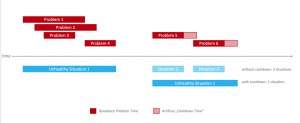
In the above diagram, you can see how this concept can reduce the number of problem situations handled by an operations team. I’ve also introduced the concept of a “cool down time” to further reduce the number of alert tickets. The cool-down time is just an artificial extension of a problem – should any new problem occur during that time the previous “unhealthy situation” (or ticket is reused). I also must note that in my case alert tickets are not closed by humans, but by Dynatrace once it determines the state is back to normal.
Back to my “Swimlane Visualization” of problems and unhealthy situation across all environments:
Welcome to the matrix…
For this visualization I used the same backend architecture as for the real-time visualization I presented previously. Plus, the additional handling over overlapping problems and consolidating into “unhealthy situations”:
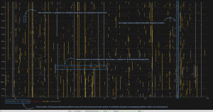
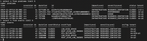
- Every vertical line in this screen represents a problem or an unhealthy situation of one environment within a week (vertical axis length represents time). When you look closely you will notice quite some “noise” – lots of problems with a short duration.
- The color of the line reflects the impact of the problem: infrastructure, service or application.
- At the bottom of the screen, you will also notice the total number of problems detected by Dynatrace (11686) and the number of calculated “unhealthy situations” (7317) of overlapping problems in single environments.
This means that almost 40% of all problems are occurring in parallel with another. In other words, if we would create support tickets for unhealthy situations instead of problems, we can reduce the number by 40% and save a lot of resources.
Optimizing problem notification time
One critical parameter when integrating Dynatrace with automatic ticket creation or waking an on-call person in the middle of the night – is the notification time. You can configure this in an Alerting Profile within an environment. This time defines when Dynatrace will invoke the integration to 3rd party system for a problem after it has been detected. For example, invoking a webhook that creates a ticket in an ITSM system.
As you know by now, I’m working with large-scale setups. An unfiltered or immediate creation of support tickets with the above number of problems would lead to 11,000 tickets within a week or still 7,000 if working with “unhealthy situations”.
The operations team I’ve been working with was convinced they needed immediate notifications for everything because previous monitoring solutions were not as accurate and often too late in notifying the team.
Dynatrace, however, works differently and problems are detected earlier and more accurately, so it’s ok to delay the notification a bit. As a matter of fact, I got complaints about too many support tickets created initially, so I started to simulate the “right” notification time, using the above visualization. I asked myself: “how would this noise change if I notified after 10, 20, 30 minutes instead of immediately?”
Setting the simulated notification time to 30 minutes drastically reduces the noise and alert tickets that would be created, eliminating short-term problems that could bombard our ITSM system! You notice the difference when looking at the same visualization when the noise has been removed:
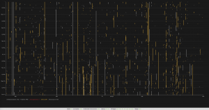
This was an interesting finding for me; it showed the default Dynatrace anomaly detection settings were a bit too sensitive for the setup I was working with as many of the short-living problems (5-25minutes duration) would resolve and disappear before anyone would be able to look at it. It would make no sense to alert a support team for those.
Tweaking notification time or anomaly detection settings
Altering the notification time would still mean Davis would detect the problem, just not invoke the creation of alert tickets. Additionally, there are more than one notification time settings for different problem types.
I also asked myself If I only want to delay the notification of problems or if it wouldn’t make sense to tweak the anomaly detection settings to not create the problems at all – without losing problem visibility.
To further optimize the anomaly detection and notification settings I had to look into the data a bit more in detail, though. Instead of looking at just problems overall, I decided to categorize them based on the severity classification and look at the event data that Dynatrace uses to figure out problems. For this I didn’t want to use simple visualization, I wanted to analyze the problem data itself.
Getting the raw event and problem data
I wanted to run a statistical analysis on the event and problem data generated by Dynatrace across all environments. The benefit of working with large setups is you get a lot of data, which makes it perfect for analysis. The data from all environments would provide some kind of collective knowledge that I wanted to base my decisions on.
The raw event data is available via API just like the problem data as well.
This can be a lot of data, especially when retrieved from thousand environments. As you have seen the numbers for problems within a week (more than 10,000) you can assume the number of plain events would be even more!
I was mostly interested in the duration of problems and events, their start and end time, the event type, their severity, and impact level. Using the consolidated API, I started to pull events and problems from all environments and store them in a time series database (influxDB).
This data-export was running periodically and after a week or two, I had enough data to perform offline analysis. I used RStudio to perform a distribution analysis of problems and events to get answers to my questions:
- What is the distribution of the problem or event duration? How long do the majority of problems last? What creates the problem noise?
- What type of problems or events happen most often?
- How can I change Dynatrace’s anomaly detection settings to reduce noise?
- What is the “perfect” notification timing setting to avoid over-creation of support tickets but also stick to SLAs?
With R (or RStudio) you can efficiently perform analysis on large data sets. It’s easy to learn and with a little coding, you can get amazing results quickly!
Problem type analysis
I’ll spare you the details (please contact me if you want to dive in) and jump right to the result of my analysis by example: Out of all problem types, I saw that the “Failure Rate Increased” (ERROR) problems were a major contributor to overall numbers. I created a histogram and box plots for these problems, which tells me a lot about my current setup and Dynatrace configuration:
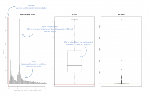
From this, the most interesting diagram is the histogram on the left as it shows that the majority of ERROR-type problems are rather short in duration, with a large amount of these problems only lasting for 1-25 minutes, with a huge spike just below 25 minutes – this is obviously the noise!
The default notification time for this problem-type is immediate (the red vertical line), meaning that an alert ticket with the operations team would be created as soon as Dynatrace detects the problem.
Knowing the operations team wouldn’t be able to take any action within 25 minutes, these tickets would be considered noise and automatically closed again without any action. This might be disputable, of course, but from an operations perspective one could question: “Are problems that only last for a couple of minutes worth investigating?” If they’re recurring, it might be a problem-pattern that should be addressed, but maybe they’re also normal operations that are falsely detected as problems?
The green line in the diagram marks the median (at about 23 minutes duration). Half of all problems are shorter than that, half last longer. If I would set the notification time for the “Error Alert” severity to 23 minutes Dynatrace would immediately create 50% fewer problem notifications!
The box plot on the right tells me about problem outliers. I can see there are obviously error alerts that last for a very long time and nobody takes care of them. That should not happen either!
Actions to take
I repeated the above analysis for every problem type and also investigated the individual event types. As a first step, I’ve increased the notification time to filter out the noise. Of course, this was only a quick remediation action. The more effective action would be to tweak the service anomaly detection parameters in Dynatrace. Of course, in such way that the short-living problem alerts were reduced but others still detected reliably.
This became an iterative process of tweaking the parameters, collecting data, repeating the analysis, and adjusting the parameters again. After some time, I found a setting that worked best for the setup and reduced the number of detected problems by ~50% while not losing visibility. Instead, we were able to focus on the relevant ones.
Something to keep in mind is that this tuning has to be reviewed if changes to the architecture or services happen to keep the optimum.
Lessons learned
When working with really large setups there comes a point when someone asks for an easy status visualization – a view from twenty thousand feet above. The consolidated API I described in part two helped me to implement this in almost no time. Data visualization and analysis helped me to understand in detail how and where I needed to tune Dynatrace settings for optimal results.
In my final part of this blog series, I’ll cover another interesting and important use-case: Dynatrace configuration as code and configuration management across thousands of environments. I believe this is the holy grail of large-scale environment management, but it’s also applicable for smaller setups where you want to establish a GitOps principle!
Stay tuned!
Start a free trial!
Dynatrace is free to use for 15 days! The trial stops automatically, no credit card is required. Just enter your email address, choose your cloud location and install our agent.


Looking for answers?
Start a new discussion or ask for help in our Q&A forum.
Go to forum