
How To Test Website on Mobile: Methods & Approach
The rise of smartphones is phenomenal, as a growing number of consumers are leveraging the potential offered by the smartphone ecosystem. As per April 2019 data of Statistica[1], the global mobile population accounted for 4 billion unique users. That’s not all; international mobile traffic is expected to increase sevenfold between 2017 and 2022.
The daily media consumption on mobile devices has grown by 504 percent since 2011[2]. The rise of mobile internet usage is evident across developed and developing economies (India, Bangladesh, etc.)[3]. Globally, consumers prefer their mobile phones for performing activities (e.g., online shopping, bill payments, etc.) that require internet connectivity.
The website should be mobile-friendly and have a Responsive Web Design. This makes it access your products (or services) with ultra-ease on their hand-held devices for the target customers. Mobile-first design should accompany mobile website testing to deliver a flawless web experience to your target audience.
With many mobile devices, it becomes a daunting task to offer the best experience on all mobile devices. Offering the best experience on all mobile devices becomes a daunting task. Different screen resolutions and viewport sizes add another layer of complexity to mobile website testing. In this blog, we dive deep into the various aspects of mobile website testing including useful tools better testing process.
Table Of Contents
- 1 What Is Mobile Web Testing?
- 2 Why Do We Need Mobile Web Testing?
- 3 Benefits of Mobile Website Testing
- 4 Limitations of Mobile Web Testing
- 5 Why Should We Perform Mobile Web Testing?
- 6 Why Mobile Website Testing Matters for Businesses?
- 7 How To Better Plan Our Mobile Website Tests?
- 8 How to Execute an Effective Mobile Website Testing Strategy?
- 9 How to Perform Mobile Website Testing?
- 10 Choosing the Right Approach to Mobile Website Testing
- 11 Conclusion
What Is Mobile Web Testing?
Mobile web testing is a form of test that’s performed to check if websites or web apps perform uniformly across various browsers and screen resolutions. This testing can also be called mobile web responsiveness testing.
Why Do We Need Mobile Web Testing?
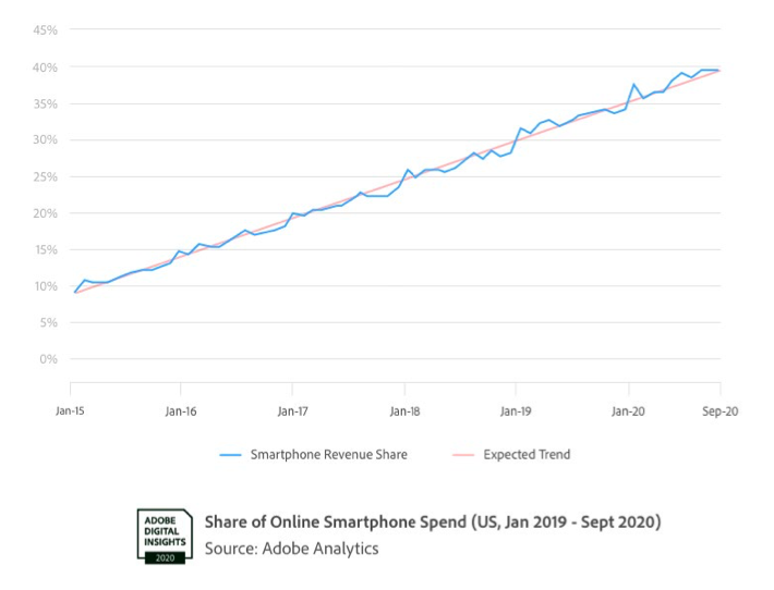
Adobe Retail Shopping Insights (2020) found that more than 42% of consumers have done their holiday shopping via smartphones. What’s interesting to note is that, despite working from home, Adobe projected that the average spend on smartphones was around $28B, which was in the USA alone.

Let’s look at the following graph that depicts the smartphone revenue trend. Yes, with more people buying smartphones, the demand for offering better experiences gets higher.
The number of users consuming content via smartphones in India is exponentially higher. According to Statcounter, mobile users stand at 76.98%, leaving desktop users behind at 22.48%. That explains why most of us have adopted the mobile-first approach to crafting mobile-friendly user experiences.
But with the growing smartphone user base, two things are a given: one — There will be more people who will want to access your website via mobile, ensuring excellent quality and usability for your websites for mobile and testing them well will become very important. So, in this post, we’ll talk about mobile web testing, why it’s essential, and its best approaches.
Major Reasons to Focus on Mobile Usability Testing
Testing the website for mobile compatibility and responsiveness drives a positive customer experience. You also gain an upper edge over your competition when mobile website testing is an integral part of the product development roadmap. Here are major reasons to focus on mobile usability testing of your web product:
1. Mobile-first indexing
Popular search engines like Google give preference to websites that are mobile-ready[4]. If your web product is not mobile compatible, chances of appearing on search results (in the first few pages) are grim.
Mobile website testing helps in serving your customers with a flawless performance on popular screen resolutions. It also helps you gain more leads as chances of coming up on search engines increases manifold when your website is built with a mobile-first approach in mind.
2. Speed and Accuracy
Personalization and Convenience are the primary reasons why consumers prefer mobile phones over desktops/laptops. As a part of the mobile website testing strategy, your team tests the website from different perspectives on varied mobile screen resolutions.
This in turn helps in building a more responsive web experience for your intended audience.
3. Exceptional User Experience
A good user experience plays a pivotal role in on-boarding new users and keeping the existing users hooked on to the product. This can only be realized by performing thorough mobile website testing on devices widely used by your target customer segment.
4. Mobile Device Compatibility
Giving priority to mobile website testing does not mean that you have to perform testing on all ‘categories’ of mobile phones available in the market. Data based on the market segmentation can help your team in focusing on a selected category of smartphones.
The next step is testing the website’s experience and performance on the target devices and fixing the issues encountered in the test process. By following this approach, mobile website testing helps in building a mobile-first website experience.
Mobile website testing lets you deliver an exceptional end-user experience across different mobile devices – a factor that can go a long way in wooing your customers.
Benefits of Mobile Website Testing
Mobile web testing brings several benefits to development teams:
1. Browser Compatibility: It ensures your website works seamlessly on diverse mobile browsers like Chrome, Safari, and Samsung Internet.
2. OS Compatibility: Tests on various mobile operating systems like Android and iOS guarantee a glitch-free experience across devices.
3. User-Friendly Design: Optimizing for mobile enhances user-friendliness, crucial for retaining visitors and driving conversions.
4. SEO Advantage: Google favors mobile-friendly sites, contributing to higher rankings.
5. Enhanced Visibility: Well-tested mobile sites are more likely to attract and retain users, boosting overall visibility.
Mobile web testing accelerates website responsiveness, providing enriched user experiences on many devices.
Limitations of Mobile Web Testing
Effective as it is, mobile web testing does have its limitations:
Hardware Variation:
Emulators can’t replicate the full spectrum of hardware differences among real devices, potentially missing device-specific issues.
Network Conditions:
Real-world network variability, like slow or unstable connections, is challenging to mimic accurately in testing environments.
Touch Interaction:
Emulators might not fully capture touch interactions and gestures, vital for mobile user experiences.
Limited Environment:
Testing environments can’t cover all device types, OS versions, and network conditions, leading to potential oversights.
Dynamic Content:
Emulators may not handle dynamic content and real-time interactions as precisely as actual devices.
Performance Variation:
Mobile device performance can impact user experience, and emulators may not reflect this accurately.
Despite these limitations, employing a combination of emulators, physical devices, and real-world testing scenarios helps maximize mobile web testing effectiveness.
Why Should We Perform Mobile Web Testing?
Our users consume content on different devices and different browsers. Most browsers have different screen resolutions which needs optimization for the products to function across these various devices. Users may not return to the sites if the websites or web apps are not responsive. Here are some reasons why mobile web testing is important:
For A Better Search Result Ranking:
Google ranks websites based on how mobile-friendly they are. If the sites are mobile-friendly, they’ll also show up in the search results, thereby increasing our site’s discoverability factor. A simple way to find out if our website or a piece of code is mobile-friendly is to take up Google’s Mobile-Friendly Test.

For Device Compatibility:
We’ve already discussed that our users browse on different devices, and these devices come with different screen resolutions. A wise thing to do is to understand what sort of devices our users have so we can prioritize web development and testing for those particular devices.
According to Statcounter, only 8.88% of users have devices with a screen resolution of 1920×1080 and at least 13.81% of users have 360×640. For a better picture, let’s take a look at the following graph.
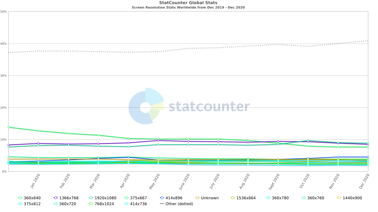
To ensure our websites run uniformly across all screen resolutions, we’ve got to perform mobile web testing.
For An Enhanced Performance Speed:
If the page load time is long, a user tends to lose interest in accessing the website or web app again. With mobile web testing, we can check and rectify our page load time, and also see if our site’s performance speed is consistent across various browsers. We can also gather page’s speed from Google’s PageSpeed Insights.
For A Better Design:
Aesthetics matter; for mobile responsive websites to retain and attract users, our websites should also have a great design. Outdated browsers lack support for niche design features and perform mobile web testing to ensure our features work as intended.
Why Mobile Website Testing Matters for Businesses?
In today’s digital landscape, mobile website testing is no longer a luxury—it’s a business necessity. Here’s why:
1. Ubiquity of Mobile Devices: With a significant portion of web traffic originating from mobile devices, ensuring a seamless user experience across them is paramount.
2. User Expectations: Users expect websites to perform flawlessly on smartphones and tablets. A subpar mobile experience can lead to lost customers and a damaged reputation.
3. Google’s Mobile-First Indexing: Google prioritizes mobile-friendly websites in search rankings. Businesses not optimizing for mobile may witness a drop in visibility.
4. Competitive Edge: A well-tested mobile site gives your business an edge over competitors, showcasing your commitment to user satisfaction.
5. User Conversion: A mobile-friendly site enhances user engagement and encourages conversions, positively impacting revenue.
6. Brand Perception: A glitch-free mobile experience reinforces your brand’s credibility and reliability.
How To Better Plan Our Mobile Website Tests?
Now that we’ve established the importance of mobile web tests, here are a few things to consider for planning our tests better.
Is My Site Functional?
For our sites to function uniformly across all devices and browsers, we have to set certain checkpoints that include
- Are all the links opening up?
- Is the navigation functioning the way it’s intended to, across different screen resolutions and browsers?
- Are forms and interactive elements working?
- Are all elements and images optimized for different browsers and screen resolutions and are they functioning as intended?
Testsigma recommends UI testing to check the site’s functionality. We’ll have the flexibility to check how different elements behave on the UI because a mobile website’s functions are mostly UI driven.
Executing these tests on various devices helps ensure that these functions are compatible across various devices and browsers even before including them in the website/web app.
You can check how to get started with mobile web testing with Testsigma here.
Is My Site Offering Uniform Visual Experience?
Checkpoints for ensuring our sites are offering uniform visual experience:
- Is the site’s visual experience uniform across devices with various screen resolutions?
Is the site performing consistently across different mobile viewports? Our mobile viewports are generally smaller than the screen-resolution and hence it’s important for our site to be visually uniform across both smaller and bigger viewports. Besides, that’s the only way to achieve mobile responsive websites.
Take a look at ViewPorter’s report on viewport dimensions for different devices. This could come in handy while performing a test.
We recommend UI testing or User Interface testing for validating the visual elements on the site. With this test, we can find out whether the visual elements meet the performance and functionality expectations.
Apart from checking if the visual elements are working correctly, this test is also helpful in finding how the website handles any user actions. You can also check out our article on how to automate mobile UI testing.
Is My Site’s Performance Speed Good Enough?
Users trust sites that load faster and to ensure speed, we have to set these checkpoints:
- Is our site’s load time uniform across a range of devices? For instance, if our site takes three seconds to load on Chrome, is it consuming the same amount of time on Safari too?
- Is our site’s navigation performing the way it’s intended to, across various browsers? We’ve got to check how long it takes for our users to complete a purchase or to interact with various elements on our site, and if that’s uniform across various browsers.
Honestly, there’s nothing better than automation testing on a real device to understand how our site is performing across various devices. Since, the performance of a site is also subject to network connectivity, low battery, memory consumption, start-up time etc., we’ll understand how these factors can affect the speed.
How to Execute an Effective Mobile Website Testing Strategy?
First and foremost, you cannot take a big-bang approach for mobile web testing else your testing process might enter into a potential deadlock state! Prioritization of product features and mobile devices (on which testing has to be performed) should be the starting point of the process. With this, let’s look at some of the best approaches & tools that can help in building a rock-solid mobile website testing strategy:
Validation of HTML and CSS Code
Start with validating the website (or web app) code for the removal of potential HTML and CSS errors. It is recommended to use open-source tools like W3C mobileOK Checker. Rather than following a manual approach for HTML and CSS code validation.
It is one of the most handy tools when it comes to checking the mobile-friendliness of your website. The tool also gives a detailed report about the failures on the website that are further sorted on a severity basis (i.e. Critical, Severe, Medium, and Low).
Chrome Dev Tools is another tool for checking and fixing issues related to a website’s HTML and CSS code. It also lets you perform mobile website testing on throttling network conditions; a real scenario in today’s world where mobile internet usage is rising at an alarming rate!
Mobile Friendliness Testing
Mobile-Friendly test from Google is another useful tool that helps in testing the mobile-friendliness of your website.
You also get a site-wide mobile usability report that gives insights into your site’s CTR (Click Through Rate), mobile usability enhancements, and more.
Responsive Web Testing
If you are on the lookout for a free option that helps in responsive testing of your website or web app, you should checkout Responsinator. With Responsinator, you can perform mobile website testing on various screen resolutions. It is also used for testing the website’s layout – an integral part of a mobile website.
A browser tool like Responsinator also lets you resize the website to suit specific device viewports. However, it can only be used for performing a basic sanity test. Apart from Responsinator, many other tools can assist you with responsive web design testing.
Testing selectively on device emulators and real devices
The million-dollar question is “Should you use emulators or real devices or both for performing mobile website testing”? Setting up a device farm is an expensive and non-scalable option. Emulators are good for user interface testing. You can make use of device emulators for performing tests where the major focus areas are the website’s UI, UX, and other aesthetic factors.
Real devices should be used for performance testing. Cloud device testing is the best way to scale up devices & operating systems on which tests are performed. With Testsigma, you can perform flawless mobile website testing on real devices that your organization does not maintain.
Cloud device testing is the most preferred option when you run tests on real devices that your target customers us. By leveraging the Testsigma ecosystem, you can run cross-browser tests on 2,000+ Android and iOS devices on Testsigma’s cloud.
Automation tests for testing your website’s performance and user interface can be run at scale on actual devices that are neither owned nor maintained by you. The entire mobile website testing activity can be expedited by running tests in parallel on different browsers, platforms, and real mobile devices.
Using Mobile emulators and real devices, find issues related to UI, UX, performance, and critical aspects of your mobile website.
Automation Testing on a scalable and secure Cloud
Once processed the testing outline and priotrities, the critical step is choosing the ‘best’ approach to perform testing at scale. Test automation is best-suited for tests with a predictable outcome, as the tests can be automated using some testing framework. The downside of choosing a testing framework is not being able to leverage the expertise of the black-box testing team.
Testsigma is one such platform that lets you deliver an awesome mobile app experience for your customers. The uniqueness of Testsigma is that no coding expertise is required for performing mobile website testing. This provides an opportunity to project stakeholders like QA Engineers, QA Managers, Product Managers, Program Managers, etc. for participating in the mobile website testing process. Along with website testing, Testsigma can also be used for mobile app testing and API testing.
Signup for free and see it for yourself
Automation Tests are written in simple and easy English, thereby resulting in reduced test maintenance and less flaky tests. Rather than running the tests on a less scalable & high-maintenance in-house infrastructure, automation tests can be performed on Testsigma’s scalable, secure, and low maintenance cloud.
Testsigma also supports integration with:
i. CI/CD tools (Jenkins, Circle CI, etc.)
ii. Project Management tools (JIRA, ALM, etc.)
iii. Communication tools (Slack, Microsoft Teams, etc.)
iv. Bug reporting tools (JIRA, Bugzilla, etc.)
Thus, automation tests can be run as an ‘integrated process’ rather than a ‘standalone’ process – a necessity where CI/CD has become an integral part of the software development & testing process. You can refer to our detailed coverage on getting started with mobile app and mobile website testing using Testsigma.
How to Perform Mobile Website Testing?
- Device Diversity: Test on various devices covering various screen sizes, resolutions, and operating systems.
- Browser Variability: Ensure compatibility across major mobile browsers, verifying consistent rendering and functionality.
- Navigation and Usability: Test user interface elements, navigation menus, and forms for ease of use and responsiveness.
- Performance: Evaluate loading times and overall responsiveness on mobile networks.
- Functionality: Verify that all features, such as buttons, links, and interactive elements, function seamlessly.
- Responsive Design: Check if your website adapts well to different screen sizes, orientations, and devices.
By adhering to these steps, you’ll be equipped to offer a flawless mobile experience to users, enhancing your business’s digital presence and customer satisfaction.
Choosing the Right Approach to Mobile Website Testing
When it comes to mobile web testing, choosing the right strategy (or approach) becomes extremely important. Remember, the right strategy will help in accelerating the TTM (Time To Market). It also helps in seeking feedback and fixing issues that are reported by your early set of users.
So, which approach should you choose – Manual or Automated or a mix of both? As per my experience, here are list of cases which QA Managers would want to consider when opting for mobile website testing:
1. Small Projects – For bootstrapped startups who are working on a tight budget and tighter deadlines, automation testing might be too much to afford. For mobile websites (and apps) with simpler user-flow, manual testing might be sufficient. The primary reason is there aren’t many complicated scenarios that need exhaustive testing.
With the introduction of newer features, you might want to scale up the efforts involved in testing. This is where startups can choose freemium products like Testsigma that let you perform automation testing at scale.
Talk to our experts to know more about Testsigma
In short, manual testing is good to start with but can impact the TTM, test coverage, and quality (to a certain extent)!
2. Large-scale projects – Automation testing is best-suited for feature-heavy projects since manual tests might not be sufficient for testing all the features in the website (or app).
For sections in a website (or app) with dynamically changing user interface, go for a manual testing approach, as the automated test script may (or may not) work for all the scenarios. Leverage automation testing when the results are definitive and manual testing for long workflows (and dynamically changing UI).
Depending on the feature-set, go for automation-only testing or a mix of manual & automation testing.
Conclusion
Mobile website testing has become an inseparable part of the website design, development, and testing process. In this blog, we had a detailed look at some of the best tools for performing responsive web testing, cross-browser testing, and more.
When it comes to testing your website for mobile devices, it is important to leverage the potential offered by mobile emulators and real mobile devices. Rather than housing a local in-house infrastructure for realizing mobile website testing, a platform like Testsigma can be instrumental in testing your website on 2,000+ real devices that are accessible through the cloud.
According to you, what are some of the must-haves when devising a fool-proof strategy for mobile website testing? Do leave your views in the comments section…
Learn More – Challenges of Mobile Test Automation
[1] Mobile-internet – Statistics
[2]Average mobile data traffic per smartphone selected regions