
In this post, I wanted to share how I use Google Analytics together with Dynatrace to give me a more complete picture of my customers, and their experience across our digital channels.
Whilst these tools have overlapping capabilities, I believe they are best used in parallel.
Google Analytics
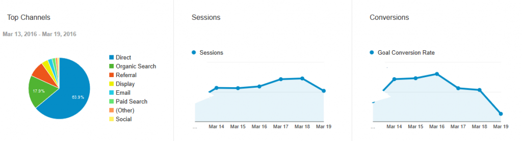
Almost all marketers will be familiar with Google Analytics. For those not familiar, I use it on a daily basis with standardized reports, but I also self discover insights on the fly.
Specifically, I look at:
- How many sessions, page views, bounce rates, time on site and conversions?
- Which pages are viewed the most, how did they get to that page, and what are they doing after? i.e I selfishly look at my blog posts (like this one) and see whether LinkedIn, or Twitter, drove more traffic!
- Which channels has my users (or robots and spam for that matter) come in from (direct, search, social, email)?
- For each channel – what did they do next (convert, view more pages, bounce off)?
- Lastly, I often do a week on week or quarterly comparisons with simple date toggles so I can compare time periods.
This doesn’t fully sum up how I use Google Analytics, but for those who aren’t familiar with it, it should serve as a basic overview.
Dynatrace – understanding customer experience
Dynatrace provides some overlap with Google Analytics; specifically visits, conversions, bounce rates, and top landing pages.
My primary reason for using this additional tool-set, however, is to understand the experience of the visitors, and if there are errors, our web team can drill into these;
- What is the experience of those people coming to my site for every single user – satisfied, tolerating or frustrated?
- If I see tolerating and frustrated visitors, is it related to a region, country, device, or an operating system?
- Are these visits impacted by response time or code/application issues?
- Are marketing conversions being impacted by poor user experience?
- Are my top landing pages impacted by poor user experience? (i.e People are more likely to abandon a landing page that has a poor user experience, than a deeper page).
Digital and Business Analytics
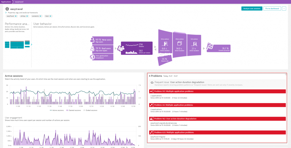
The simplest way to understand if your users are having a good experience or a bad one is in my business dashboard which focused on both dynatrace.com and my Marketo pages.
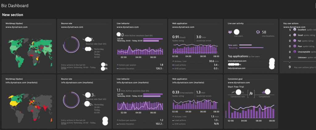
Above I get a really simple view of user experience, bounce rates, types of users, trials and response times.
I’m also pretty fond of the user experience world map.
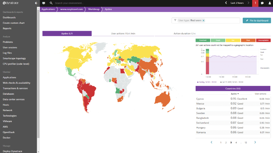
For me, it’s as simple as green is good, yellow not so good, and red is bad. This is a calculation derived from the response time of the application and error errors that occur during the visit. Technically it’s called Apdex and you can learn more about it here.
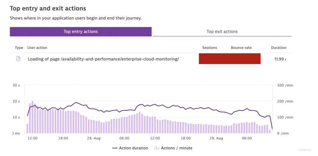
First impressions count – reviewing entry actions
The other simple dashboard I use, which is available by default is below.
In this view, I tend to focus on entry actions, but first impressions are critical.
For me, the most important landing pages are the homepage and paid search campaign pages. It’s critical these are fast and error-free as customers are most likely to bounce if these pages are slow.
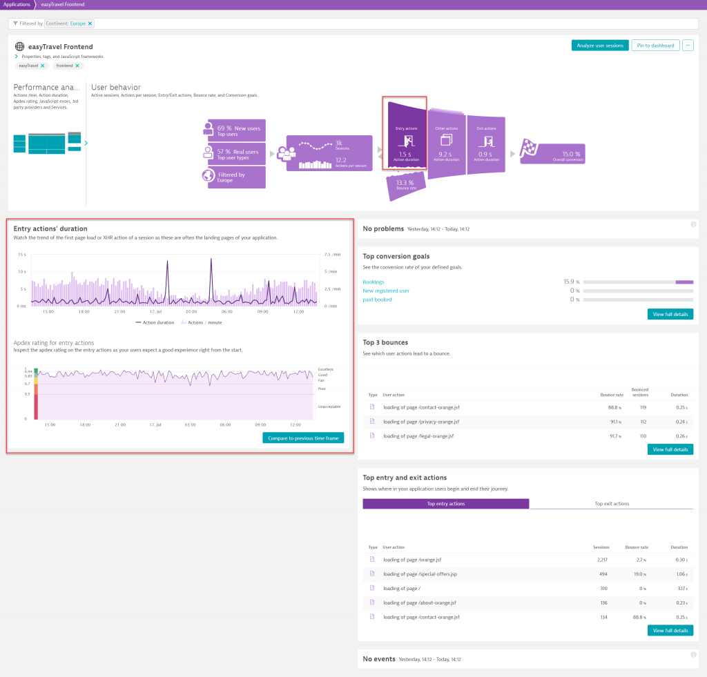
If we see an issue, or more importantly if Davis® (The Dynatrace AI engine) picks up a reduction in traffic or an increase in errors, we are quickly able to pinpoint why and fix it.
Session Replay – See every user experience in 4K
One of the newer features to come into the Dynatrace solution is Session Replay.
Once I discovered I could query user sessions based on the pages users went to (user action name), I was hooked.
Now I have immediate feedback into how people are browsing our site and how we can improve our design.
Notice on the video below that the words are appearing slowly, which I’m not sure we would pick up without Session Replay. Also, the speed at which people scroll means we will consider A/B testing pages with far less copy.
Using Davis, the AI Engine
Lastly – I don’t even really need to drill into user experience because Davis alerts me, and our web teams if there are issues.
Just a few weeks ago I was notified of a response time degradation on one of our key pages.
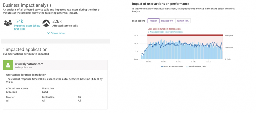
What happened? We trialed Twitter advertising. For as little as $5k, we slowed our page down to a crawl. At 10+ second action duration, there is no way anyone converted (our bounce rate was 95%) and impacted our other campaigns.
So we turned it off.
Thanks, Davis!
The three most important marketing questions that Dynatrace addresses, that Google Analytics doesn’t tell me are:
- Are my users impacted by poor user experience (slow loading pages or errors)?
- Are my most important pages, those that I’m heavily invested in (paid search, advertising, blogs etc) responding fast enough in order to maximize conversions? (2.5 seconds is my goal!)
- How are users engaging with the page? Are they scrolling to the bottom, reading lots of words, clicking images? Session Replay goes a long way in helping me, and our design team, optimize pages.
The questions you might ask are going to be specific to your use case and your job. Hope this helps.
Start a free trial!
Dynatrace is free to use for 15 days! The trial stops automatically, no credit card is required. Just enter your email address, choose your cloud location and install our agent.


Looking for answers?
Start a new discussion or ask for help in our Q&A forum.
Go to forum