NEW: Exploring RUM sessions

If you want to understand how people actually experience your site, you need to monitor real users. The data we get from real user monitoring (RUM) is extremely useful when trying to get a grasp on performance. Not only does it serve as the source of truth for your most important budgets and KPIs, it help us understand that performance is a broad distribution that encompasses many different cohorts of users.
While real user monitoring gives us the opportunity for unparalleled insight into user experience, the biggest challenge with RUM data is that there's so much of it. Navigating through all this data has typically been done by peeling back one layer of information at a time, and it often proves difficult to identify the root cause when we see a change:
"What happened here?"
"Did the last release cause a drop in performance?"
"How can I drill down from here to see what's going on?"
"Is the issue confined to a specific region? Browser? Page?"
Today we're excited to release a new capability – your RUM Sessions dashboard – which allows you to drill into a dataset and explore those sessions that occurred within a given span of time.
Explore your data
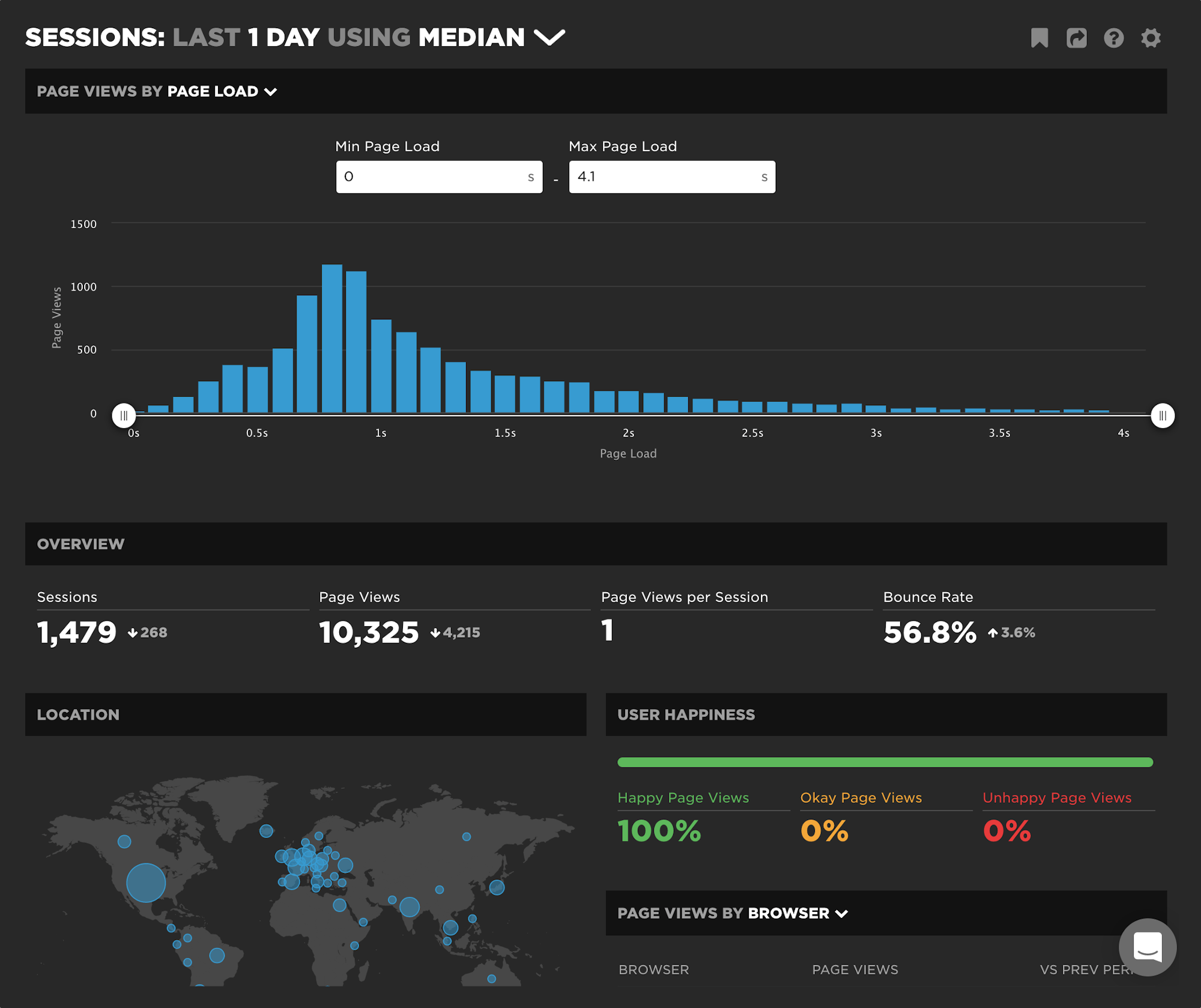
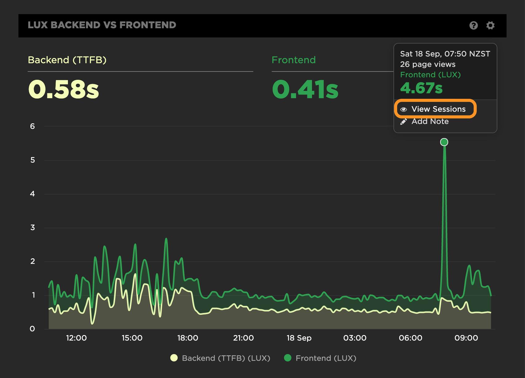
Drill into any RUM data point from any chart in your dashboards to investigate RUM sessions. Whether you're looking into a spike, a baseline change, or a segment from a specific distribution you're interested in, clicking through to 'View Sessions' takes you to your new Sessions dashboard. (You can also navigate to the dashboard from the left-hand navbar.)
When you arrive in the dashboard, you'll get a great breakdown of your sessions for that particular point in time. You bring along any of the context from your chart as well, including any filters that have been applied to that dataset. You'll instantly be able to understand the unique breakdown of user sessions across several dimensions, including geography, device, browser, page groups and more.
Get a tour of the dashboards in this short video:
Understand what changed?
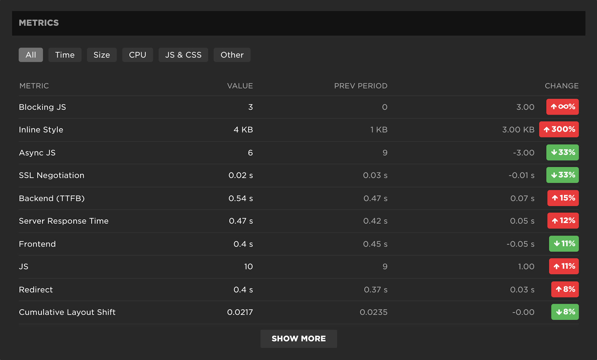
Answering this question can be difficult and time consuming when you are dealing with a vast amount of RUM data. We make a point to highlight changes from the previous period. The change may be related to volume ("I'm seeing a lot more users from Ireland today" or "We are getting a lot more traffic to our landing pages") or it may be related to a metric ("LCP has really slowed down after this last release, and it looks to be driven by slower backend time"). Whatever the change may be, the comparison to the previous period can be found in several areas of the dashboard.
Investigate anomalies
Weird stuff happens. Whether you want to understand the long tail of performance or a specific pattern you're seeing in your data, it's useful to be able to quickly slice, dice, and compare.
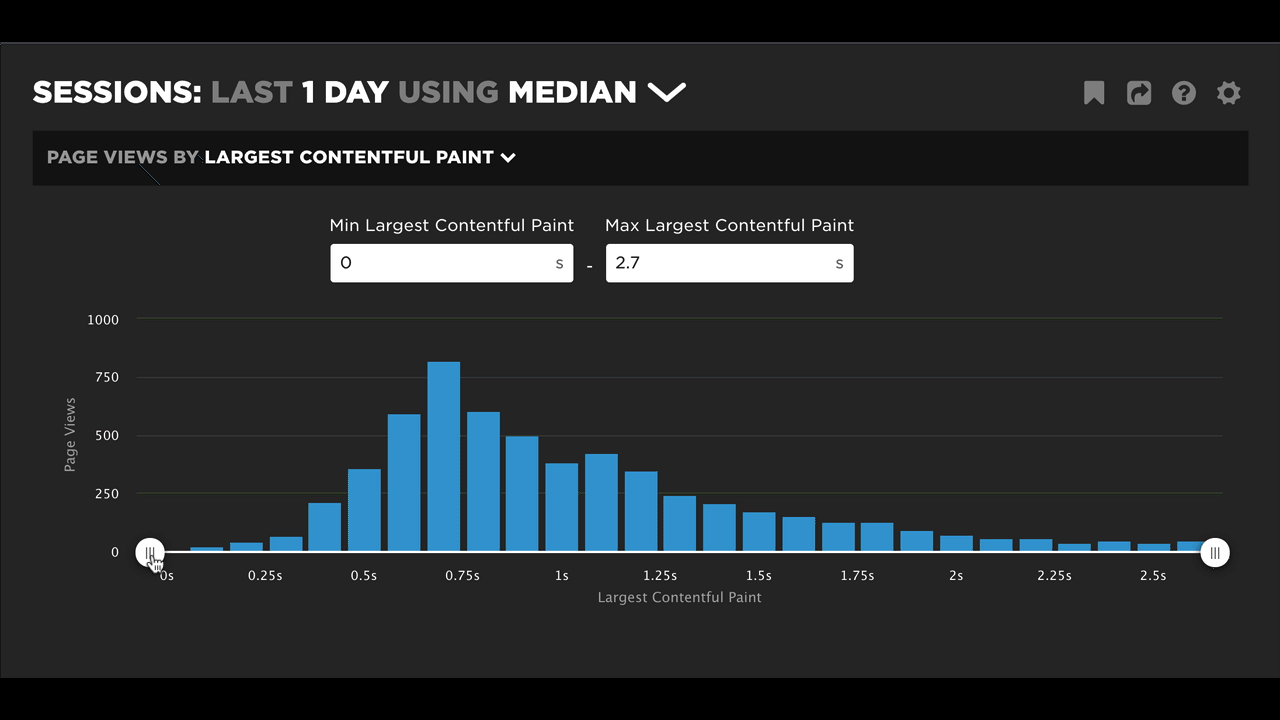
In this video, we explore the mystery of what's behind a site's segment of fast bounces.
Questions?
Want to learn more about this feature? Do you have feedback on how we can make it even better? Let us know!
Read Next

See how customers are using SpeedCurve to make their sites faster.
See industry-leading sites ranked on how fast their pages load from a user's perspective.