


Upgrade to the Data explorer to level up your data visualizations and analysis
Dynatrace
SEPTEMBER 14, 2022
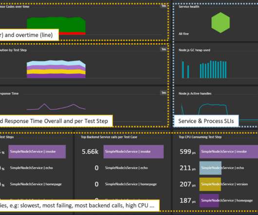
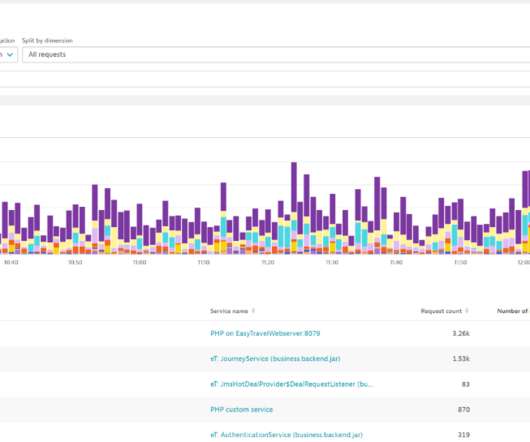
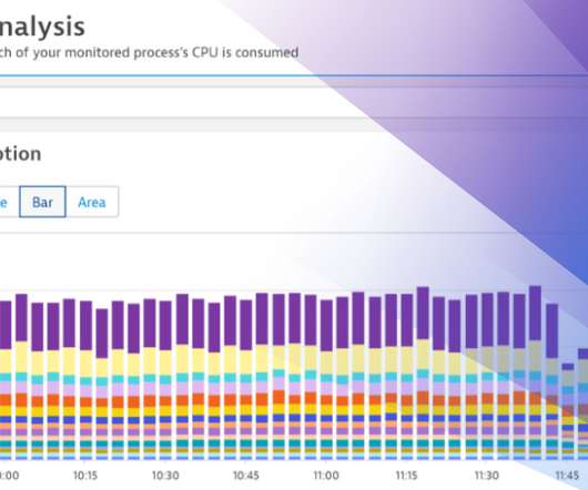
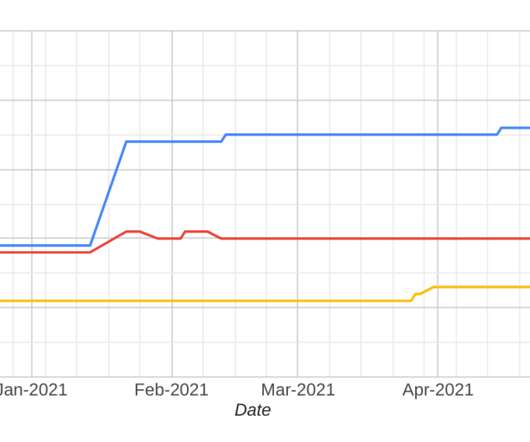
Override the color for an individual metric or series —whether you want to adjust charts to match your CI or want more visual distinctness than the default palette provides. Visualize workloads over time and by type using stacked charts. Stacked area and stacked column charts are now also available in the Data explorer.


Let's personalize your content