
Reporting deltas (i.e, comparing differences) between sets of timeframes or other logical units, is a valuable practice for evaluating business success. To do this effectively, it’s essential that you be able to look at all cohorts at once so that you can fully understand the complete picture. With the release of Dynatrace 1.177, you can now do exactly this—our most recent dashboarding update provides a powerful comparison feature for all available dashboard tiles.
Compare metrics and KPIs over time
Comparisons over time are necessary for analyzing trends. In talking to our customers, we know that flexibility is key here. Because providing a limited number of comparison timeframes wouldn’t meet customer expectations, we’ve made sure to allow for complete custom timeframe comparisons based on a powerful new timeframe expression language.
In a previous blog post, my colleague, Wolfgang Beer, touched upon the newly available timeframe selection features, as they’re also accessible via the new Metrics REST API. We’ve built upon this functionality by adding an expression language that allows for extensive date calculation expressions. For example:
-7d to nowspecifies the timeframe of the last 7 days.-14d to -7dspecifies the timeframe of the 7 days previous.
Other supported expressions are y for years, M for months, w for weeks, h for hours, m for minutes and s for seconds.
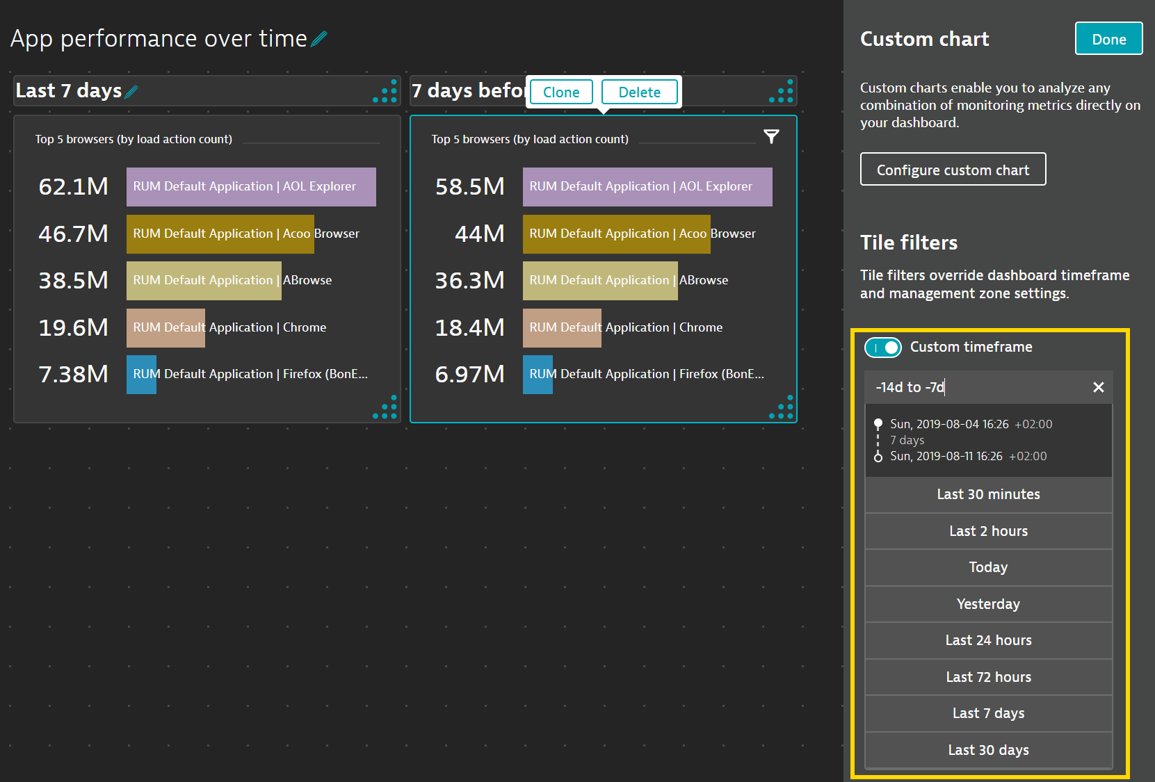
The Tile filters section in the dashboard tile’s configuration sidebar allows you to define a custom timeframe that overrides the current dashboard settings.
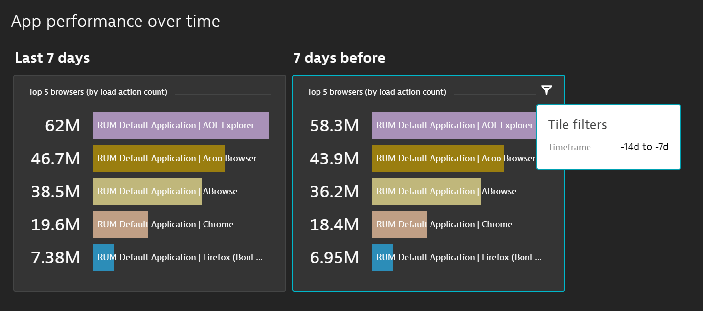
The Custom time frame input field takes whatever timeframe expression you provide. As you can see in the example below, a list of preset timeframes that is also provided for quick selection.
Compare application health state across management zones
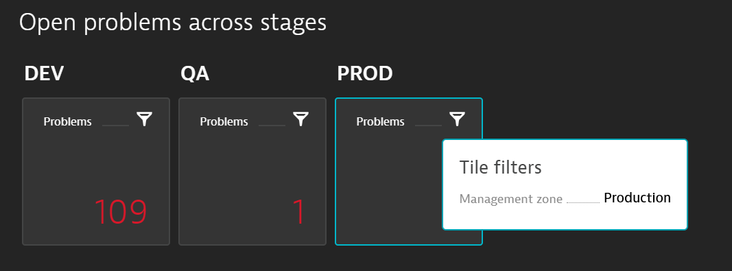
Management zones are the primary tool for segmenting information in Dynatrace. While dashboards have always been configurable and filterable for a specific management zone, dashboard tiles have now inherited this capability as well. Timeframe comparisons for management zones can be configured using these same controls.
When editing a dashboard tile, the Tile filters section of the configuration panel contains a management zone control. By default, tiles inherit the management zone setting of the dashboard that they’re displayed on. However, you now have the option of selecting a different Custom management zone for each individual dashboard tile.
This new degree of flexibility allows you to build single-dashboard overviews that can, for example, show the health state of applications or other entities across multiple management zones.
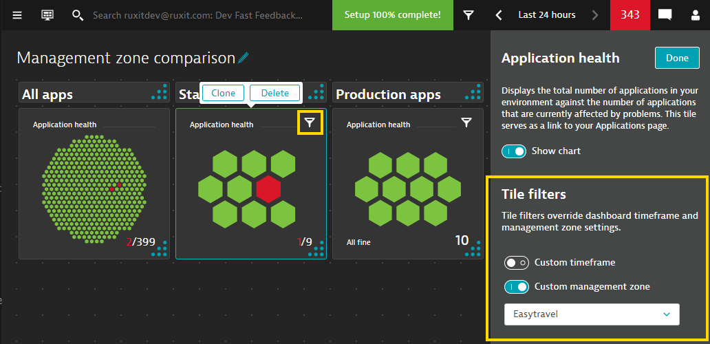
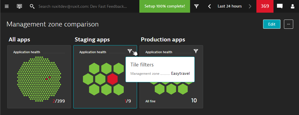
The small filter icon in the top-right corner of each configured dashboard tile indicates that the tile has custom filtering applied to it (in contrast to the rest of the dashboard, which relies on global dashboard settings). When you hover over this icon (or tap on a touch-enabled device), a tooltip displays the active filter settings of the tile.
A health-state comparison can also be built using the Problems tile, which shows the number of open problems. Use this tile to compare the number of problems within different management zones to give you a quick idea of which organizational/logical unit you should take a closer look at.
Limitations
- The management-zone filter for dashboard tiles is supported for all tiles except those that are designed for a fixed-entity context, such as the Service or Web application tiles.
- Tile-specific management-zone filters override dashboard management-zone filters; they don’t extend them.
Other improvements
The recent update to Dynatrace dashboards also includes the following features:
Cloning dashboard tiles
Another way to quickly build comparisons is by duplicating an existing dashboard tile. With our recent update, the Clone button for dashboard tiles allows you to do this.
Cloning multiple tiles in one single step is supported as well—simply select a range of tiles and click Clone!
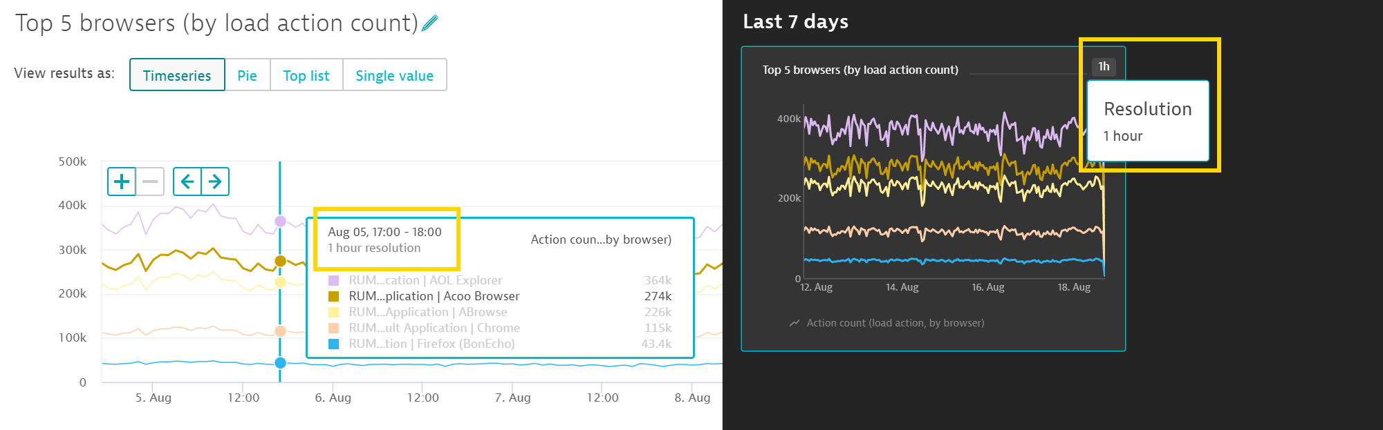
Timeseries chart resolution
Timeseries charts automatically use the resolution that’s most appropriate for each configured timeframe (the goal is to show approximately 120 data points within each timeseries chart). However, it hasn’t always been obvious what the applied resolution is when looking at a time series chart, so we’ve made some improvements:
- Timeseries charts in the custom chart view show the current resolution within the tooltip that appears when you hover over the chart (see example below left).
- Dashboard tiles that display timeseries charts include a Resolution icon in the top right corner. Hover over this icon to display a tooltip that shows the active resolution setting (see example below right).
What’s next?
Our current focus is on precise improvements to existing chart visualizations and to work on strategically important new features, such as scheduled dashboard reports. In the next couple of updates, you can expect to see these improvements, among others:
- Improved chart legend for timeseries charts
- Configurable Y-axis bounds for timeseries charts
- Configurable chart colors for metrics that share the same splitting factor


Looking for answers?
Start a new discussion or ask for help in our Q&A forum.
Go to forum